Thursday, May 29, 2014

Exercise 10: Capturing the moment

I considered this exercise the natural development of the previous one.
The aim is to find, as for the last exercise, a ‘comfortable’ situation, possibly even the same location, and concentrate on bursts of activity, from which trying to capture a ‘best’ moment.
Judging and capturing the moment that works best in an image is an important step in progressing photography of people.
When finished shooting, I am supposed to review my images and pick out those that, for me, best capture a particular moment explaining my choice.

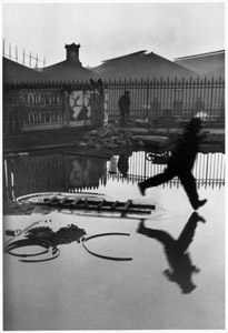
"There are two parts to photographing the moment: deciding what it should be, and capturing it – not necessarily in that order. While you may shoot carefully and sparingly until you know that you have it, you can also shoot more freely and choose the key frame later in editing. Many moments are difficult to predict, and reveal themselves only as they happen. Some, indeed, reveal themselves later, not quite as you may have expected when you were shooting. In the image ‘Man Jumping Over Puddle, Paris, France, Gare Saint Lazare 1932’ by Henri Cartier-Bresson, you can imagine the precise moment – the forward foot less than an inch from touching the surface of the water – involved some luck, in addition to the photographer’s very fast reflexes."


Derriere la Gare Saint-Lazare - Henry Cartier-Bresson

“The Decisive Moment” was a term coined by the pioneer of street photography, Henri Cartier-Bresson. 
During his time, photography was still a relatively new art medium and it wasn’t taken seriously. Furthermore, photographers were often criticised for not having the same discipline and creativity as traditional artists as photographers can create their images in a matter of seconds, not hours.
Cartier-Bresson believed that “The Decisive Moment” was that split second of genius and inspiration that a photographer had to capture a certain moment. 
For example, that half of a second that you have when a man is jumping over a puddle, when a couple embraces for a kiss, or when a person points a finger at another. 
This moment is fleeting, meaning that once you miss that half of a second to capture that moment, it is gone forever. 
You can never recreate the same circumstances in terms of location and people.

During my shooting session at the local market in Metz, I took about 300 photos and reviewing the result of my work I had to make a selection according to what I considered the best captures.
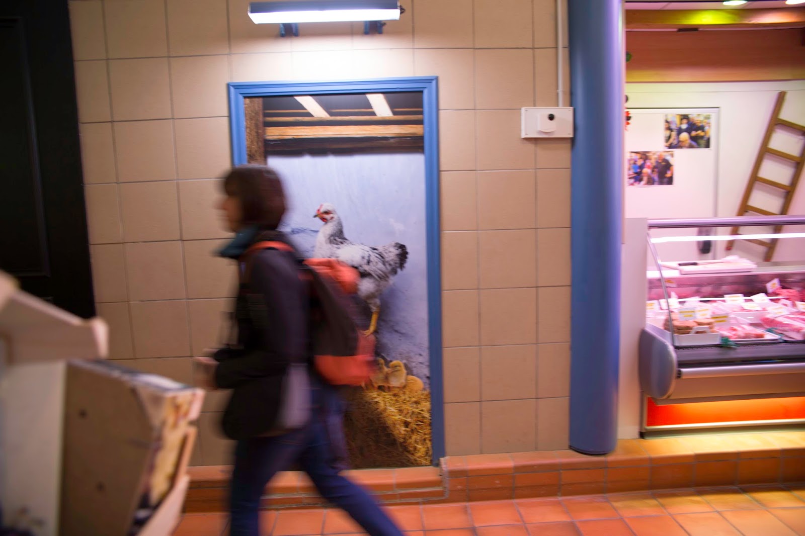
When shooting Image 1, I was behind some boxes and as a background I had a nice image of a hen going up a stair.
Image A is one of the first shots where I spotted the potential interesting frame.

Image A.


However, clearly, there was still a lack of narrative and the image was definitely not ready to be taken.
So I waited for somebody, a person or an action that could be interesting in relation to the background.
As depicted in Image B, the first people passing were blurred and really not relevant for my photo.

Image B.


Suddenly, an old man came and stopped just within the frame of my picture.
Still, Image C was not what I wanted, but I felt I was close to something interesting.

Image C.


When the man turned his head towards me I took the photo.
I like Image 1 because of the peculiar expression of the man.
I believe there is an interesting narrative.
The man stopped and looked at me wondering: "Am I dreaming? There is a photographer in a market behind a pile of broken boxes taking a photo of a photo of a hen climbing a stair. What the hell is he doing?"
And I think that his facial expression of him wondering all this is simply great.
In a way his frozen, puzzled posture is very similar to the one of the hen.
There is almost a symmetry between him and the hen, enhanced by the blu column between them.
Moreover, the ladder behind his head is like a giant exclamation mark expressing his feelings.
Obviously, I am not Cartier-Bresson, but I think that, for the above mentioned reasons, this was my best decisive moment of my photo session at the local market in Metz.

Image 1.


Exercise 9: Developing your confidence

The first exercise of "Part Two - People unaware" asks to choose an outdoor situation where there will be lots of people and activity, and take as many photographs as I comfortably can in one session.
Review the photographs afterwards, recall the comfort level I felt at the time, and consider to what extent this helped me in capturing expression and gesture.

I have to admit that I felt at ease in doing this exercise because it corresponds to my favourite photographic activity: street photography. I really enjoyed this easy exercise.

I decided to go out at Metz's local market and let guide myself by the inspiration.
I took about 300 shots and I selected the 12 photos I liked the most.

Image 1.


f 4.5, 1/160 sec, ISO 100, 70 mm

Image 2.


f 4, 1/125 sec, ISO 100, 70 mm 

Image 3.


f 5, 1/200 sec, ISO 100, 70 mm 

Image 4.


f 4, 1/125 sec, ISO 100, 70 mm 

Image 5.


f 4.5, 1/160 sec, ISO 100, 70 mm 

Image 6.


f 8, 1/250 sec, ISO 100, 24 mm 

Image 7.


f 5.6, 1/250 sec, ISO 100, 70 mm 

Image 8.


f 5.6, 1/250 sec, ISO 100, 63 mm 

Image 9.


f 5.6, 1/125 sec, ISO 100, 39 mm 

Image 10.


f 5, 1/100 sec, ISO 320, 24 mm 

Image 11.


f 4, 1/125 sec, ISO 100, 70 mm 

Image 12.


f 2.8, 1/40 sec, ISO 320, 24 mm

Sunday, May 18, 2014

Sophie Calle - L’Hôtel

In his Tutor's report, Robert suggested me to add a "Research" section to my blog and asked me to elaborate on few questions regarding Sophie Calle’s project “L’Hotel”.

Sophie Calle is a French artist and her work frequently depicts human vulnerability and examines identity and intimacy.
She is known for her detective-like ability to follow strangers and investigate their private lives.

When first reading about Calle's work I was really impressed by her "Suite Venitienne" (1979), where she followed a man she met at a party in Paris to Venice and where she disguised herself and followed him around the city, photographing him.
Calle’s surveillance of the man, who she identifies only as Henri B., includes black and white photographs accompanied by text.


"I know so little about him, except that he had rain and fog the first days, that he now has sun, that he is never where I search. He is consuming me."

One of Calle's first projects to generate public controversy was Address Book (1983).
I like very much the idea and the story behind this photographic project.
The French daily newspaper Libération invited her to publish a series of 28 articles.
Having recently found an address book on the street (which she photocopied and returned to its owner), she decided to call some of the telephone numbers in the book and speak with the people about its owner.
To the transcripts of these conversations, Calle added photographs of the man's favorite activities, creating a portrait of a man she never met, by way of his acquaintances.
The articles were published, but upon discovering them, the owner of the address book, a documentary filmmaker named Pierre Baudry, threatened to sue the artist for invasion of privacy.
As Calle reports, the owner discovered a nude photograph of her, and demanded the newspaper publish it, in retaliation for what he perceived to be an unwelcome intrusion into his private life.


“Thus, I will get to know this man through his friends and acquaintances” 

"L’Hôtel" is one of the most well known works by Sophie Calle.
"On Monday, February 16, 1981, I was hired as a temporary chambermaid for three weeks in a Venetian hotel. I was assigned twelve bedrooms on the fourth floor. In the course of my cleaning duties, I examined the personal belongings of the hotel guests and observed through details lives which remained unknown to me. On Friday, March 6, the job came to an end." (Quoted in Calle, pp.140-1)

1. What did you think about Sophie Calle’s “L’Hotel”?

Sophie Calle's work takes the form of a collection of evidence using photographs and texts that document her practice.
The project is documented and this forms the presentation of the work including a behaviour close to stalking people.
What I like the most from “L’Hotel” is the story behind it.
I like the project, the forensic attitude, the almost obsessive accuracy, the detail.
Her art goes "beyond", she is "pure" and that is what I like.
In a way, she reminds me about the Magnum photographer Antoine D'Agata, met in a workshop in Luxembourg in 2010: an artist without compromises.
I appreciate a lot also her texts, used with her photos.
I like to write poems to match with my photos and, therefore, I am very sensitive to this kind of combination.
I do not find the photos from "L’Hôtel" particularly stunning, but I believe that they are not supposed to be. They are just there to document the project.
Calle's work is very much tied up with a process.
As she describes (below), the form of the final product - the thing which the gallery viewer actually sees - is the least significant part.


"For 'The Hotel' I spent one year to find the hotel, I spent three months going through the text and writing it, I spent three months going through the photographs and I spent one day deciding it would be this size and this frame...it's the last thought in the process."    


2. Can you ‘read’ anything about the characters of the inhabitants by interpreting the ‘traces’ they leave behind?

I found very interesting how Calle can identify the people in the rooms just by examining their belongings and how messy/clean they are and also as she quotes in one of them ‘the bed has not been slept in’.
What is it that really identifies people?
Calle is unashamedly voyeuristic, reading diaries, letters, postcards and notes written or kept by the unknown guests (sometimes evidence of family's troubles) and looking into wardrobes and drawers.
Listening at the room doors to some guests conversations and the sounds that are coming from the rooms it adds to her diary entries and helps her identify the ‘unknown’ guests.
As she describes in the interview reported below, her projects began in 1979 on returning from a trip to Paris after traveling abroad for seven years.
The way in which it has been described as though on her return she felt like a stranger within her own city and she had no idea on how to occupy her time.
Which is when she started to follow random passers-by and it developed on from there.
It made me think about all the possible ways you could go about identifying a particular person, she was in a unknown room and yet after investigation she knew about these guests that she hasn’t seen before?
An unusual but really inspiring piece of work that teaches how to look out of the box.

https://www.youtube.com/watch?v=cRx7nFVuLwA

3. Are you ethically challenged by her ‘nosey’ photographs of other people’s lives?

I believe that art is art and that every artist should follow his/her own inspiration and make it co-exist with his/her personal ethic.
I also believe that law is law and every person has to take responsibility of what he/she does in front of the law and that, in case of infringement, he/she should pay accordingly.
Personally, I would not feel my privacy offended if Sophie Calle decided to take me as a subject of one of her "investigative" works.
I would understand the essence of her project and very likely allow a break of my privacy.
I have a similar judgement in case I decided to undertake a similar project.
I like street photography and often I take pictures of unaware people.
I always have a great deal of respect and I do not take pictures of somebody who is not willing to be photographed.
However, often I do not know if my subject wanted or not. I just take the photo, without hiding, but without asking neither.
Where is the ethical border between do and don't?
Between my street photography and Calle's in the hotel?
Personally, my ethic would not stop me in undertaking a work like "L’Hôtel".
However, I appreciate that ethics and sensitivities are personal and can be radically different from one individual to another.
That is why our societies have got laws.


Assignment 1 - Comments on Tutor's report

Plus side

- In his “Overall comments” my tutor Robert appreciated my work.
"This is a strong first assignment showing good technical and visual control and an understanding of the vital relationship between subject and photographer in this ‘People Aware’ section.
I really like the diversity of visual ideas you present here – not only among the ‘assignment’ pictures but the other experiments – which shows you’re looking for diversity in facial expression, character, mood as well as ‘image’.
I also like the way you’ve thought about design and colour in these photos, which changes the mood.  On the whole a good start, with only a few minor issues."
=> I think I must continue to improve my qualities in order to support the ability to express myself with a personal photographic language.

- Image 7. "This is my favourite shot here, maybe because it brings together everything you’ve done well here into a unique picture: the colour, the bold design and composition, Aline’s strong gaze and character.
It could be a wider view so that her ‘diamond shaped’ arms framed her head.  That would create a circular composition in which the eyes go around from her face to her hands holding the dandelion.
The colours work well here, the dark green background, the pink top and the spots of yellow flowers.   And you’ve nailed a really glowing even exposure on her skin."
=> I am very happy about this comment and I fully share it. I believe that the shot is the best of the assignment and it manages to show Aline's charme and intensity. 


Things to improve

- Image 1. "I’m not sure whether the green and pink are distracting here or whether they enhance the photo. Possibly her collar does pull the eyes away from the pink lips."
=> Personally, I think that the green and pink enhance the photo. I tried to hide the pink collar with PS, but I really do not like the result.

- Image 3. "Again the colour co-ordination here is quite good – the simple blue background and the pale skin and white shirt work well together.  You could probably reduce Yellow in the skin a bit – I guess that was a mixture of daylight and artificial light.  Paler and cooler tones here would bring it more in harmony with the Pieta idea and enhance the ‘tiredness’.  You could also reduce the overall brightness, making it darker."
=> Following Robert's suggestions I got indeed a better image

Before.


After.


- Image 6. "You’ve emphasised her nose and chin a little too much with this wide-angle shot from below.  The window light is nice and gives the photo a ‘natural’ mood.  You could probably rub out that wallpaper line on the wall in Photoshop to stop it distracting the viewer."
=> Frankly speaking, reviewing the original photo, I really can not understand how I could miss to correct the wallpaper line on the wall. Here there is the final result.

Before.


After.


- "Your blog is good.  You are beginning to understand the ‘codes’ that make a portrait “intimate” or a gaze “intense” or intellectual.  But you are thinking quite technically and aesthetically at times: about the image quality, light etc.
Try to add to this an understanding of the possibilities of the genre you’re your own responses to the works that you show and write about.  Don’t just be ‘generalizing’. Put a “Research” section on your blog, not just a Reading section."
=> I added a "Research" section to my blog as requested. I understand the "extra mile" I am supposed to run with this section and I will do my best to accomplish it. However, I am sure it will not be easy!

-   "You may also want to make that wonderful portrait smaller on your ‘home page’ – it necessitates a lot of scrolling."
=> Done.

Thursday, May 1, 2014

Assignment 1: A portrait

In the first assignment I am supposed to draw together my experiences in completing the first eight exercises and take one person as a subject in order to create between five and seven different portraits.
These should differ in type and style, and each be from a separate photographic session.
In my learning log I have to:
1. Critically assess my finished work considering each portrait individually.
2. Identify what has worked well and what has been less successful and analyse the reasons for this.
3. Consider where I need to strengthen my skills and understanding and explain how I hope to achieve this.

Aline is passion. Aline is feelings, strong feelings.
Northern European rigour and latin feelings: the best sides of the French world.
Aline is energy; positive, enthralling, engaging, gripping energy.
Aline is pure life, flowing freely and uncontrollable.
No compromises on her values: generosity and honesty.
And that is the way she offered herself to my camera: a true storm of emotions.
I got her clear, profound and transparent look in close-up portraits.
I photographed her style and her dreams in head and shoulders shots.
I could explore few less classical ways of taking a portrait thanks to her great deal of humanity.
And I understood.
I understood that the moment between the beauty spot on her right cheek and the scar on her forehead is endless because it passes by the deep immensity of her look.

During the different shooting sessions (about 10) I had great fun and I was able to go beyond my limits of student photographer.
I am surprised at how long it has taken me to set up and take each portrait for the assignment; three weeks, taking each portrait at a different session.
For each portrait I took a sequence of images until I felt I had the correct expression, or pose that conveys the message I am aiming to get across.
The photos I have chosen can be split into two groups: traditional portraits (close-ups and head and shoulders), which are the seven photos required by the assignments, and some more "experimental" shots.


Close-ups

The first three images are close-ups aiming to convey three different expressions, all typical Aline's way of being.

Image 1.


f 2.8, 1/60 sec, ISO 320, 70 mm

Taken in a wood close to my house on a bright but sometimes cloudy late afternoon using available light. 
My subject stood sideways in a small path in the nature, I stood at an angle looking towards her.  
I wanted to take advantage of the rather soft diffused light coming through the trees. 
I am especially pleased with the lighting and the crop in this portrait. 
I wanted to capture her facial expression closely with no other background distraction and shoot her head framed tightly. 
This image is a celebration of Aline’s determination.
  
Image 2.


f 2.8, 1/50 sec, ISO 800, 70 mm

Taken indoors in a early afternoon on a couch using the available light coming from a large window.
I took a series of photographs moving back and forwards, watching her facial expression carefully. 
I wanted an aura of tranquillity and contentment to be present, not a cheesy grin. 
In post production, besides few standard adjustments, I reduced the "clarity" in order to have a softer image and increase the dreamlike atmosphere of the image.
I like the final result because it well depicts Aline's delicacy, but I am not sure if technically the shot is too soft.

Image 3.


f 2.8, 1/60 sec, ISO 800, 70 mm

Taken indoors in evening with tungsten light from the ceiling.
In this shot Aline was tired. Likely because the "ball-buster"(as she defines me) photographer did not stop shooting at her.
I like this image because it reminds me of a "Pietà", not really in a Michelangelo's style, but still conveying a sort of sensual suffering.
I believe that also the strong colour of the background helps to highlight the decisive moment of the shot and amplifies the effect of the photo.


Head and shoulders

The next four images are head and shoulders shots taken during four different sessions.

Image 4.


f 3.5, 1/80 sec, ISO 100, 45 mm

Taken outside in late afternoon with diffuse daylight and clouded sky.
I have to say that, when I saw this potential location, it was the contrast between the textures of the site and the texture of the human face that stroke me.  
I believe that this head and shoulders portrait highlights that contrast successfully.  
The softness of skin texture, the light smooth shine on the lips, the gentle look, the slight highlight in the eyes, and the tones of skin and hair, all contrast markedly with the rough, hard, decaying textures and atmosphere in the background.
I also like the grey colour of the background embracing and almost melting with the colour of the sweater.

Image 5.


f 2.8, 1/40 sec, ISO 250, 45 mm

Taken indoor with tungsten light from the ceiling.
I love this image because it is a combination of planning and collaboration. 
Aline and I discussed a lot regarding poses that she might suit taking her height and frame into consideration. 
Aline looks very intense in this image. 
She has a sort of top-model attitude that I really like. 
The pose could be called a little bit glamour-esque but I think the combination of a genuine expression and innocent outfit move away from this completely. 

Image 6.


f 2.8, 1/30 sec, ISO 250, 24 mm

Taken indoor with natural light coming from a large window.
The focal length is shorter than I usually use and this meant to get physically closer to my subject with the attempt to create an intimate image that reflects our close relationship.
I think that the dreaming look is very well supported by the light of the shot.
I like a lot the naked skin that highlights the intimate moment of reflection and the posture of the head turned towards an almost visionary look into the future.
This is one of my favourite shots of the assignment.   

Image 7.


f 2.8, 1/160 sec, ISO 100, 42 mm

Taken outside in the afternoon with natural diffused light and clouded sky.
The light has created catch lights in her eyes, the most important feature in such a composition, and I feel the direct eye contact draws the observer towards them.
I like very much the intense look and the position of the hands playing delicately with the flowers over the head.
I appreciate the original crop (no post production involved) that provides a good, balanced framing of the subject and I like the contrast between the main colours of the shot: pink, green, white and yellow.
This is definitely my favourite shot of the assignment.


"Experimental"

Image 8. Action


f 8, 1/250 sec, ISO 100, 24 mm

"Starting in the early 1950s I asked every famous or important person I photographed to jump for me. I was motivated by a genuine curiosity. After all, life has taught us to control and disguise our facial expressions, but it has not taught us to control our jumps. I wanted to see famous people reveal in a jump their ambition or their lack of it, their self-importance or their insecurity, and many other traits."
This statement of Philippe Halsman and his very famous photographic project "Jumps" inspired this shot.
I like a lot the idea, I appreciate the crop (Aline is almost jumping out of the frame), but I really do not like the background (the trampoline in my backyard).

Image 9. Street photography


f 5.0, 1/160 sec, ISO 100, 51 mm

The crop and the contrast between Aline and the little girl walking away are the two elements that I like in this shot taken while she had a business call.
Everything looks delicate. The soft scarf around her neck, the way she holds her mobile, the little girl gently walking away.
Also the narrative can be rather interesting. Who is she calling and why? What is the relation between her and the little one? Is the child running into a danger? 

Image 10. The "Wearing" project


f 4.5, 1/20 sec, ISO 100, 70 mm

"The capacity of photo-conceptualism to dislodge the surface of everyday life through simple acts occurs in British artist Gillian Wearing's - Signs that say what you want them to say and not signs that say what someone else wants you to say - . For this work, Wearing approached strangers and the streets of London and asked them to write something about themselves on a piece of white card; she then photographed them holding their texts. By making the thoughts of her subjects the focus of the portraits, Wearing proposes that the capturing of the profundity and experience of everyday life is not intrinsic to the traditional styles or compositions of the documentary photograph, but is more effectively reached through artistic intervention and strategy."
I learned about Wearing's project thanks to the book "The Photograph as Contemporary Art" that I am reading in the framework of this course.
I like a lot Wearing's idea and I decided to try to replicate it with Aline.
She wrote in French "Finally free" and I personally adore the way she showed her statement.
The look, the hand on her chin, the posture of the head, show a sort of challenge to the viewer. 
A sort of "I am gonna be free if you like it or not!"
I like the contrast between this sort of provocation and the gentle way she holds the paper.
Knowing Aline, this paradox, the contraposition between the "tough" and the "delicate", is very much the quintessence of her way of being and I think this photo well depict it. 

Image 11. Juxtaposition


f 4.0, 1/40 sec, ISO 100, 29 mm

It was Aline's idea and I bought it.
I do not think the photo is particularly original, but in my view it is well executed, reframed and corrected in post production.
I think that the shot is relevant not for the technique nor for the pure aesthetic, but more for the person that Aline chose to juxtapose to her face.
I believe that Marilyn Monroe's destiny, her willingness to be loved, her determination in life, are very close to Aline's heart.
Aline is a riddle wrapped in a mystery inside an enigma.
The message is strong and very personal and my photo is only the media transmitting it.


I really enjoyed doing these shots with Aline and I am rather happy with my results.
I am also happy because my model was pleased with the shots and actively (and patiently!) participated in this highly demanding exercise.
I have also let my recent reading affect my work.
I have also really enjoyed reading the first chapters of the book "The Photograph as Contemporary Art" and it gave me ideas and the confidence that I can create some photographic contemporary art.
However, in my opinion there is still a lot to do.
I am good at seeing situations and using ambient light and with help of editing get good results in my pictures.
On the other hand, I have to work on a “check list” in my head that I get less depended on what I find but that I can give better structure to my photo sessions.
I think I have a good feeling for locations but need to strengthen my directing-skills giving the model better orders what to do and finally to be able to imagine the picture in my head before the shoot and work towards it with model, light and so on instead of "doing the best of the situation".
I believe that the possible best way of doing that is practice, practice and practice till I am getting used to that and I improve myself.