Monday, June 30, 2014

Exercise 15: A public space

For this final exercise, I am supposed to transfer my attention from an organised occasion to a semi- organised public space.
Instead of a single event, there will be a variety of things happening, even if not all of it is particularly active or focused.
I am requested to try to capture the sense of varied use — how people make their own personal or small-group activities within the same general area.

Recently, I spent a couple of days at the Parc Animalier de Sainte-Croix (close to the French city of Strasbourg), a fantastic park of about 1,200 hectares where my kids enjoyed a very exiting holiday.
During that days spent in the nature I decided to take advantage of my free time in order to shoot the images for the exercise 15.
I considered the public space of such a park as a perfect and original location for this exercise.
I am rather satisfied by the quality of the photos that I selected amongst the about 500 shots I took.
However, I have to admit that I would have preferred to find more people and activity to photograph, but as the park was almost empty (we were there in the middle of the week and the school holidays in France have not began yet) I was obliged to take mainly the persons who came with me.

Image 1.


f 5, 1/100 sec, ISO 100, 24 mm 

"Here she is, papa!" 
I like Image 1 because it depicts the unbounded energy of a child in a park.
It goes beyond the photo, it passes through a two-dimensional image and it becomes a driving force that pulls the narrative of a shot.
Moreover, I adore the dirt on the hand sneaking into the photo. 
It clearly tells about the intensity of a day lived without saving a single drop of energy.

Image 2.


f 4, 1/100 sec, ISO 100, 45 mm  

The profile and the dress of the little girl sitting on her father's shoulders makes me think about Little Red Riding Hood.
Even more if I think that she is in front of a pack of wolves!
It is indeed a pity I did not have the reflex to change my f stop from 4 to 22 in order to have the animals on my shot.

Image 3.


f 9, 1/500 sec, ISO 100, 51 mm  

The heat and the fatigue were omnipresent.
Image 3 depicts the two.
I like the background and its colour enhancing the sense of heat, but I also appreciate the posture of the boy who is slowly and almost unconsciously getting rid of his rucksack. 
I think that also the wet t-shirt helps adding drama to the shot.

Image 4.


f 4, 1/80 sec, ISO 100, 45 mm  

Image 4 is not a strong image, but I think it has merit to well illustrate the major activity in such a park: looking and wonder.
The tourist (no doubt she one with such a dress!) looks at the dazzling landscape in front of her and I can almost perceive her wonder in her eyes.
I like the graphic, but not necessarily the light of this shot (the burned central stripe).

Image 5.


f 10, 1/400 sec, ISO 100, 34 mm  

This and the next are my favourite shots of this exercise.
Feet and shadows are the central subjects for both.
In Image 5 I like above all the shadows which play a sort of graphic design on the wooden floor and recall to me a game of embroidery.
I doubted long time during the post production regarding the clarity, vibrance and saturation of the image, particularly for the shadows.

Image 6.


f 7.1, 1/200 sec, ISO 100, 24 mm 

In Image 6, the combination of flashy colours, shadow and grey asphalt fascinates me.
The subjects are the same than the ones in previous image, but here I find the narrative stronger.
I think that the colours and the posture of the feet and the body in the shadow transmit a sense of movement, a kind of a soft "rave party" energy that I really like.
I also think that the light vignetting of the post production enhances the general feeling of the shot.

Image 7.


f 7.1, 1/250 sec, ISO 100, 37 mm  

Looking at image 7, I wonder what is more tiring: the heat or the endless run of the children? 
Probably both. And the photo witness both rather well.
I left intentionally the right part overexposed in order to stress this effect.

Image 8.


f 7.1, 1/250 sec, ISO 100, 24 mm  

I like this shot for its contrasts.
The colours, green and red; the wires, the headphones and the pipes; the dress in the heat.
I do not like very much the background (above all the concrete behind the lady), but this is a true quick street photography shot and I did not have the time to choose a better place.

Sunday, June 29, 2014

Exercise 14: An organised event

For this exercise I am requested to research, prepare in advance and look for an organised event at which there will be plenty of people and in which I can confidently expect to be able to photograph freely and with some variety.
An event at which spectators are in seats will not do; one in which people move around will be more useful.

The 23rd of June is the National Day in Luxembourg.
Being the most important organised event of the year, I decided to take advantage of it and use it as the subject for this exercise.
During the afternoon I shoot more than 600 photos and the followings are the ones I consider to be the most appropriate for the brief.
The last four images are my favourites.

Image 1.


f 5, 1/200 sec, ISO 100, 70 mm 

Here it is: Luxembourg and its formal and conformist look.
A small village elected to the status of a country by historical hazard.
I consider the narrative of the shot to be rather interesting, above all for a Luxembourgish resident who can appreciate the peculiar milieu of the photo.
I think it is a pity I did not have the time and the reflex to use a higher depth of field. 

Image 2.
  

f 5, 1/200 sec, ISO 100, 70 mm  

What I like the most in this rather elementary shot is the look of the green lady. 
Despite her extra-terrestrial appearance, I find her look very human.

Image 3.


f 3.5, 1/60 sec, ISO 100, 42 mm  

I have to admit that I have been taking several shots from this peculiar spot.
I adore the installation done in the main street of Luxembourg City which consists in a number of colourful umbrellas hanging in the sky.
Their reflection on the black background in a specific spot of the street, created a sort of dreamlike atmosphere that charmed me.
Unfortunately, I do not think that the narrative of the photo is as strong as it should be.

Image 4. 


f 6.3, 1/160 sec, ISO 100, 24 mm  

I know, very likely Image 4 can be considered out of the scope of exercise 14.
However, I like it a lot.
I like the image in itself for its simplicity, the frame, its four clear "points" (the slipper, the two cigarettes boxes and the paper), the line of cobblestone sidewalks ending where the slipper is.
I also like the narrative which well depicts a street after a national party and the questions it leaves unanswered.

Image 5.


f 5.6, 1/160 sec, ISO 100, 24 mm  

I find the red-green colours pair of the image very interesting. 
Their combination with the sky looks to me rather charming too.
However, the man coming out of the trash-bin with all "his" chaotic party of people seems to me the most relevant characteristic of the shot. 
Funny narrative indeed!

Image 6.


f 5, 1/200 sec, ISO 100, 63 mm 

What the hell is this kid doing?
I do not have the answer, but I like this kind of crazy, colourful, handmade installation that manages to attract all the attention of the young boy and harmoniously melts its colours with his in a unique blend of tints.

Image 7.


f 7.1, 1/400 sec, ISO 100, 70 mm 

The last image is supposed to close the National Day "reportage" with its long late afternoon shadows and the two last Luxemburgers going back home.
Besides the very "clean" background, I appreciate the way the couple walks away almost marching together, like they saw the soldiers doing earlier in the day.  
The man's hand expresses a sort of formal tension that recalls to me the look of the lady with the red hat in Image 1. 

Saturday, June 21, 2014

Exhibition - Henri Cartier-Bresson

"To take a photograph is to align the head, the eye and the heart. It's a way of life." (Henry Cartier Bresson)

HCB is my favorite photographer and recently I had the chance to attend his exhibition in Paris.
On from 10 February to 9 June in Paris's Centre Pompidou, it brings together 350 photographs taken between the early 30s and the end of the 70s.
Look back on the 20th century through the lens of HCB, and it's all there: the jazz age of the 1920s, colonial Africa, the Spanish civil war, developing human rights, capitalist expansion, two world wars, Ghandi's funeral, decolonisation, Mao, the first man in space, America booming, student protests, the collapse of the Soviet bloc – all captured in black and white.
The ambitious show, which aims to showcase his "incredible eye", has been made possible by a collaboration between the Henri Cartier-Bresson Foundation and Magnum Photos.

The Pompidou's exhibition underlines the reach and diversity of his images, where other retrospectives have tended to focus on the unity of the work.
By placing his photography at the roots of the surrealist avant-garde – not surprising, given the location – the exhibition explores all the ramifications of this idea – from social engagement to visual experiences, from Parisian shop windows to American baseball matches and from Communist journals to Mexican alleyways.


HCB was the patient photographer: he knew how to wait for the decisive moment.
He was the photographer with perfect geometry: the formal harmony of his shots is masterly.
HCB was the discreet photographer: he never intruded into the scenes he photographed, so he didn’t interfere with what was happening.


Dubbed, and with good reason, “the eye of the century”, HCB created many photos that are classics of twentieth-century photography.
He knew how to catch the decisive moment, the spontaneity of everyday events as they occurred, and record its immediacy for all time.
As his famous and much-repeated quote has it: "Photography is, for me, a spontaneous impulse coming from an ever attentive eye which captures the moment and its eternity."
It’s a goal that only a few photographers have reached, and then only with a few lucky shots.
HCB though seemed to touch the heights and pin down the world in every shot.
Always in the right place at the right time, HBC photographed historically important events as they were happening – the political demonstrations in Paris in the 50s, Gandhi’s funeral in India and the deportation camps at Dessau – but also the small stories you find in town squares – the sensuality of a smiling prostitute or the happiness and joyfulness of children in the street.


The wide selection of his work I saw in Paris remembered me that, as HCB often said, the beauty of a photograph lies in the moment when it’s taken.
He wasn’t greatly devoted to the photos he had created, but rather had a hunger for new images and visions.
He was always on the hunt for his best photo, the one he was about to take.


Exhibition - "Robert Mapplethorpe"

During my recent stay in Paris I had the opportunity to visit two very interesting exhibitions.
The first one was a retrospective of Mapplethorpe’s work which featured some two hundred and fifty images exploring a range of themes.
They covered every aspect of Mapplethorpe’s art - bronze bodies and flesh sculptures, geometric and choreographic, still lives and anatomical details, bodies as flowers and flowers as bodies, court portraiture, night photography, and eroticism, soft and hard, self-portraiture in all its forms.


Robert Mapplethorpe - Vase

I appreciate the pure lines of the shot.
The research of aesthetic perfection in this image is what made Mapplethorpe a great artist: strong narrative (in my view, missing in this instance) and perfect technical graphic execution.
Robert Mapplethorpe was one of the great masters of art photography.
He was an artist with an obsessive quest for aesthetic perfection.
A sculptor at heart, and in his imagination, he wanted “people to see [his] works first as art and second as photography.”

The works from the photographer’s early career, which close the exhibition, revealed how the path taken by his art was already mapped out in his first Polaroids.


Robert Mapplethorpe - Andy Warrol

Over and above the erotic power that made Mapplethorpe’s work famous, the exhibition presented the classic dimension of the artist’s work and his search for aesthetic perfection from the early 1970s to his untimely death in 1989.
He was an admirer of Michelangelo: he championed the classical ideal - revised and reworked for the libertarian New York of the 1970s - and explored sophisticated printing techniques to create unique works and mixed compositions, which he framed in unusual ways.
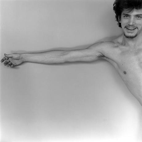
The exhibition opened with Mapplethorpe’s self-portrait with the skull-head cane: the image of a young man, already old, tragically cut down in the prime of life by AIDS.


Robert Mapplethorpe - Self Portrait

I believe that his portrait reveals how the master shadows gave free rein to his imagination.
"Like a modern day Orpheus, beyond death, he seems alive - although only just - yet already in the afterlife of his work, beckoning us with his satanic cane to follow him into the underworld of his life, in search of his desire."


Robert Mapplethorpe - Self Portrait

This self portrait was my favourite image.
The frame is fantastic, with his left eye and the finger slightly cut, the head just in the up right corner, his smile looking at you depicting the intensity and the lightness of the moment.
I simply adore this shot!

“Photography and sexuality have a lot in common,” explains Mapplethorpe.
“Both are question marks, and that’s precisely what excites me most in life.”
Exploring the photography of the body, he pushed it to the limits of pornography, perhaps like no other artist before him.
The desire in these images - often the photographer’s own desire - also reflects life in New York, as lived by some, in the 1970s and 80s, at the height of the sexual liberation movement.
“I’m trying to record the moment I’m living in and where I’m living, which happens to be in New York. I am trying to pick up on the madness and give it some order.”


Robert Mapplethorpe - Self Portrait

Monday, June 9, 2014

Exercise 13: Standard focal length

As in the previous two exercises, I am requested to concentrate on shooting with one focal length.
In this case, having a full-frame DSLR, the focal length is supposed to be between 40 mm and 50 mm.

Image1.


f 5.6, 1/160 sec, ISO 100, 45 mm

This photo and the following are my favourite shots for this exercise.
In Image 1 I like very much both the light and the narrative.
I believe that the light I managed to catch is very pure and it gives to the picture a sort of tridimensional feeling.
I think that the clouded evening sky is the key for this peculiar, magic light.
Moreover, the light expresses very well the narrative which depicts a thoughtful lady looking at Paris.
As her face is hidden, we do not know what she thinks.
And this is exactly the charme of the photo.
We can let our thoughts run like a look that goes beyond a hill, beyond our limited restrictive visual experience, towards the infinity of our imagination.

Image 2.


f 2.8, 1/50 sec, ISO 320, 50 mm

I think that the look and the posture of this shop assistant is simply great.
When I entered the shop and I saw him I had to tell him he was wonderful and I asked him if I could take a photo.
I know, this goes against the exercise's constraint "people unaware", but his long beard, his black undershirt and his alluring look deserved a shot and the only way to capture him in his shop was asking him.
Moreover, I believe that the French text over his head saying "Une fraicheur éclatante (A sensational freshness)" is the perfect title for the image.

Image 3.


f 4, 1/100 sec, ISO 100, 50 mm

In Image 3 I appreciate the visual connection between the graffiti and the little girl.
This gives me a kind of impression that the city is under the control of the children.
As a matter of fact, who else than a child could draw a "Lego" soldier on a wall?

Image 4.


f 5.6, 1/250 sec, ISO 100, 50 mm

When I arrived at Pompidou, the drunken young man appeared from nowhere and stood in front of me speechless.
His doubtful expression and the absence of words seemed to me as the simple execution of an order.
"Shut up, and do not disturb our society" stated the huge drawing on the wall behind him.
While I like the narrative of this photo, I do not really appreciate the light which I find to be not charming enough.

Image 5.


f 2.8, 1/50 sec, ISO 1600, 50 mm

In 1968, Henri Cartier-Bresson took the black and white photo depicted in Image 5 during the strike at the Renault car plant in Billancourt (France).
The only thing left in common between the modern fashionable lady looking at it and the old striking workers in HCB's shot is the red colour of her scarf.
It is a pity that 50 years later things are still not getting better at Renault.
Besides the narrative, I like how the photo is framed and its warm temperature.

Image 6.


f 3.2, 1/500 sec, ISO 100, 40 mm

What attracted me in the French man of Image 6 was his smart casual dress (very French indeed) and his stressed look.
He was clearly waiting for someone who was late.
I like the tension in his eyes and his hand ready to dial on his mobile the late coming's number.
I also appreciate the shop sign behind him which recalls once more the transalpine atmosphere of the shot.


Sunday, June 8, 2014

Exercise 12: Close and involved

After having tried with the longest focal length possible in exercise 11, this one asks me to switch lenses (or adjust focal length) to the widest angle that I have.
A true wide- angle, judged from its visual effect, is around 28 mm or less.
One of the uses of a wide- angle lens is to be able to cover a large subject area in one shot, but here I am requested to concentrate instead on using it close to people, and try to achieve a sense of putting the viewer right inside the situation.
From the point of view of comfort and confidence, this is quite a challenging way to shoot.
As with the previous exercise, I have to note down both the problems and the advantages created by working with a wide-angle of view from very close to the people I am photographing.

All the images have been taken with my shortest focal length: 24 mm.
The main challenge for such a wide angled view is that it can pull the viewer right into the centre of the scene.
It can also slightly distort the facial features of any individual right in front of the camera, creating a flat perspective.
Following my natural approach to photography, I really enjoyed taking the following shots.
I like the way this angle of view draws the viewer into the scene, it creates quite an intimate image, a feeling of being part of the activity.
A day of walk through the streets of Paris gave me the opportunity to get really close to the people while “snapping” anyone and anything.

Image 1.


f 8, 1/320 sec, ISO 100, 24 mm  

"L'amour est mort" (Love is dead) is my favourite shot.
First of all, I find the photo very "graphic" with its horizontal strips created by the strong sun light.
I like the text, written in small letters, probably by a girl.
It is a cry of desperation, intense, black like the death.
However, it is somehow discrete, with its small letters covering a small part of the large wall, almost with no intention to disturb. It seems to say: "I suffer, I have to shout it on a wall, but not too loud".
And then I like the lady passing by, lost in her "shopping" thoughts, who gives a sort of spin, a soft movement, to the image and underlines people's indifference for this (sentimental) pain.
Love is dead, but the show must go on!

Image 2.


f 5, 1/100 sec, ISO 100, 24 mm  

Frankly speaking I do not know what went wrong with Image 2.
In post production, I could have easily corrected the two black areas on the top left and bottom right corner of my photo, but I like this mistake.
It gives a kind of mystery to the shot, like if I was looking into a keyhole.
I like also the light blue colour and the reflex in the window: a dreamlike photo.

Image 3.


f 2.8, 1/40 sec, ISO 1250, 24 mm  

In the corridors of the Paris's underground you can even find a 12 elements Russian orchestra playing traditional music.
But what hit my attention more than musicians were the ladies taking photos of them.
The delicate gesture of a posh lady's hand adorned with a heavy ring taking a shot of street photography made me wonder if I am really doing the right thing ;-)

Image 4.


f 8, 1/250 sec, ISO 100, 24 mm  

 General De Gaulle heading France towards its bright future is one of the most iconic images of the "Republique".
Image 4 would like to express my humble doubt regarding the youngster French more busy in looking at their Ipods and voting Front National than in following the basic values of their great nation.

Image 5.


f 5, 1/100 sec, ISO 100, 24 mm  

I like the cut of Image 5 more than the people.
The white, the blue, the yellow and the feeling of movement.
I like Barbès, one of the most popular areas in Paris.

Image 6.


f 9, 1/320 sec, ISO 100, 24 mm  

I think that the footsteps associated with the walking girl of Image 6 convey a sense of sympathy in this photo.
The sun light is maybe too strong, but, in my view, it helps to stress the general feeling of positive attitude and optimism of the image. 

Image 7.


f 4.5, 1/80 sec, ISO 100, 24 mm 

This boy and his cap is the most well representative French I found during my stay in Paris.
I like very much his smile, his hands in the pockets; everything fits to the stereotype we have of a young French person.
I also appreciate the typical urban background that, I believe, puts in value very well the subject.
   
Image 8.


f 22, 1/20 sec, ISO 100, 24 mm 

Image 8 is supposed to underline the street art creativity.
The shot taken in front of a theatre is supposed to depict the possibility to make art with almost anything in this world.
Beside the message, I really appreciate the long shadows of the image.

Saturday, June 7, 2014

Exercise 11: Standing back


This exercise asks to select a medium-long focal length, ideally between 80 mm and 200 mm full-frame equivalent, and go for a street photography shooting session.
Then it asks to note down what practical difficulties I encountered and what special creative opportunities I found that a long focal length and distant position have given me.

Recently, I gave away my old Pentax and I bought a Canon EOS 5D Mark III with a 28-70 mm Sigma lens.
The Pentax body was equipped with a standard lens 18-55 mm and I also had a 70-300 mm Sigma lens that I rarely used.
One of the main reason why I enjoy street photography is because it is a mean to get closer to people, to express myself through them and their moment of life.
For this reason and according the experience I had with my previous camera, I did not feel the need to equip my new camera with a longer focal lens.
Therefore, I did this exercise with the longest focal lens I currently have: a 70 mm.

However, based on my previous work with the 300 mm lens I can tell that the major difficulty I encountered was the fact that my images were often blurred.
Indeed, something to consider when shooting at this focal length is to either use a tripod, or use a fast shutter speed to prevent out of focus and blurry images.
Another issue I found of being such a distance from my subject  was not really able to see them very well. Until I looked at  my images on the computer I was not too sure if my subjects expression was what I liked, or wanted.
And finally I did not feel very comfortable in playing the paparazzi.
I did not see any particular creative opportunities using an extreme long focal length that excludes the surrounding areas of clutter and somehow removes critical information about a street scene.

The following photos have been taken during my recent trip to Paris.

Image 1.


f 5, 1/200 sec, ISO 100, 70 mm 

Image 1 is my favourite shot.
The cut, the perspective, the reflection, the mirror, the fingers and her thoughtful expression are the main elements of the composition of this shot that I appreciate for its spontaneity. Both the photographer's and the subject's.  

Image 2.


f 5.6, 1/160 sec, ISO 100, 70 mm 

Even if far from Henri Cartier-Bresson's "decisive moment", Image 2 is meant to be a sort of allusion to the great French photographer and the exhibition I visited.
Would HCB have taken the old lady that way?
Probably not, but I had the pleasure to do it under his eyes!

Image 3.


f 7.1, 1/400 sec, ISO 100, 70 mm 

The light in the corner was an irresistible call to shoot.
When the little boy walked slowly into the frame I had to take that photo.
I never take photos of children for obvious reasons, but I liked so much the relation between his almost lost expression, the way he seems to walk on the water, and the spot of light above him.
His mother's look was proud of both of us. 

Image 4.


f 2.8, 1/80 sec, ISO 125, 70 mm 

Stress and smoke under a finally sunny Paris.
I appreciate Image 4 for her twisted peace-less legs and the spot of rainbow coming out from the window's glass: "Il y en a qui bosse!"

Image 5.


f 4, 1/125 sec, ISO 100, 70 mm 

I understand that the execution of the shot is not on the same level than the strong narrative of Image 5.  
The photo is probably too blurred, but I think it was worth to post it.
In my view the marching feet and the shopping bag express rather well the concept of indifference.
This is street photography too.

Image 6.


f 5.6, 1/250 sec, ISO 100, 70 mm 

I like the diagonal cut in Image 6 because it gives a sort of spin to the cool subject ready to step into a pompous French building.

Image 7.


f 7.1, 1/400 sec, ISO 100, 70 mm 

I appreciate the composition of Image 7.
The ladies and the trees, all seem to look in the same direction.
I also like the light, the shadows, the vertical lines above and the yellow horizontal ones below them.

Image 8.


f 4, 1/160 sec, ISO 100, 70 mm

I appreciate that this shot is not really of "people unaware" as the exercise would require, but I liked the sudden complicity I had with this lady preparing her shop window.
I like her smile and the text on her window that can be easily associate with the reflection of a car.

Sunday, June 1, 2014

"The Photograph as Contemporary Art" - Chapter 2: Once Upon a Time - Learning points

The course material includes also "The Photograph as Contemporary Art", a very interesting book written by Charlotte Cotton published by Thames and Hudson (London 2014 Third edition). As I decided to do for my practical course, I would like to keep track of my learning points as I gradually go on reading the book reporting the most important sentences by the above author.
No copyright infringement intended - photographs will be removed immediately upon request.

The chapter 2 considers the use of storytelling in contemporary art photography.
This area of photographic practise is often described as tableau or tableau-vivant photography, for pictorial narrative is concentrated into a single image: a stand alone picture.

One of the leading practitioners of the staged tableau photograph is the Canadian artist Jeff Wall.
He describes his work as having two broad areas. One is an ornate style in which the artifice of the photograph is made obvious by the fantastic nature of his stories. The other is the staging of an event that appears much slighter, like a casually glanced-at-scene.
He is similar to a film director who imaginatively harnesses collective fantasies and realities.


Jeff Wall - Insomnia, 1994

Philip-Lorca diCorcia's "Hollywood" is a series of portraits of men whom diCorcia met in and around Santa Monica Bd in Hollywood and asked to pose for him.
The titles of each photo tell you the name, his age, where he was born and how much he was paid to pose.
The pictures encourage a kind of storytelling in the viewer's mind.

Philip-Lorca diCorcia - Eddie Anderson; 21years old; Houston, TX; $20, 1990-92

Tableau photography often refers to specific works of earlier art.
The British artist Sam Taylor-Wood's "Soliloquy I" shows the figure of a beautiful young man expired on a sofa, his right arm hanging lifelessly to the floor.
This pose emulates a popular work by the Victorian painter Henry Wallis (The Death of Chatterton).
Taylor-Wood consciously revives the idealism bound up in Wallis's painting.


Henry Wallis - The Death of Chatterton, 1856


Sam Taylor-Wood's - Soliloquy I, 1998

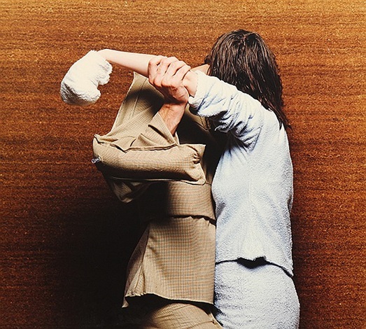
Dutch artist Liza May Post's photographs and films have magical, dream-like qualities.
In "Shadow" both figures are dressed in androgynous clothes that hide their gender and age.
The details in the photo are hyper-real and, like a surreal dream, their combination and visual charge leave the narrative open to the viewer's interpretation.


Liza May Post - Shoulderblades: Shelter, 1996

The Cuban artist Deborah Mesa-Pelly recasts fairy tales and popular stories with young female characters and with disturbing results.
Mesa-Pelly stages situations that could be scenes from the stories as they are conventionally told, but dramatised and given a sinister edge by her lighting and voyeuristic camera angles.


Deborah Mesa-Pelly - Legs, 1999

Anna Gaskell's photographs share an intense storytelling quality that combines a number of the common devises of tableau photography: a cast of children, sometimes with their faces obscured, their play gone awry or turned nasty.
The physical beauty of the prints, combined with the moral ambiguity of the narrative, makes for an unnerving visual pleasure.


Anna Gaskell - Untitled #59, 1999

British artist Christopher Stewart photographs private security firms finding contemporary allegories for Western insecurity and paranoia.


Christopher Stewart - United States of America, 2002

German artist Rut Blees Luxemburg uses the elemental devises of lighting and water reflections to create magnificent amber imagery of urban architecture.
In "In Deeper" the viewer is placed within the scene at the top of the steps of a river embankment.
Footprints are left in the wet silt on the steps leading into the luminescent river, revealed by raking lighting.


Rut Blees Luxemburg - In Deeper, 1999