Sunday, March 30, 2014

Exercise 6: Review a portrait sequence


The sixth exercise asks to set up a portrait session in a formal, structured way, in order to have a consistent setting and framing. 
For this, it will be very useful to use a tripod, in order to concentrate more on the situation, and so that the only variable between the series of pictures will be the expressions and gestures of the subject.
Plan to take a considerable number of images in order to explore all the possibilities and fine nuances of expression – at least 20. 
The essential element in this project is to concentrate fully on the person’s expression (and gesture or pose if they vary), assessing it from frame to frame in order to select what I consider to be the best of the sequence. 
This on-the-spot assessment will affect the photography in the way I talk to and direct my subject, and in the moments I choose to make each exposure; it will also affect the way I review and edit the sequence of images on the computer.
Immediately after the shooting, I am supposed to write down the frame by frame progress of my subject’s expression, noting which I felt at the time were the best. At what point did I decide that it was time to stop shooting, and why?
Next, I am requested to open the sequence of images in my browser and review the images a second time. Rate them as follows: a) not good, b) acceptable, c) good and d) the best single shot, according to my judgement. How, if at all, did this later review differ from the way I saw it at the time of shooting? 

Valentina is an Italian colleague from Cesena, a nice town close to Bologna.
Valentina likes the sun, colourful flowers in late spring, The Netherlands, discovering new people and cultures and she fights really hard for her essential values.
Despite her delicate look, I can really define her as a ballsy girl. 
During our shooting she was simply great. Not necessarily as a subject, but more as a smart counterpart.
She was very patient (we needed almost 3 hours) and she made me understand at least 3 important concepts:
1. I must keep cool. I am the photographer, it is my thing and I need to concentrate on my work, on my art and not necessarily on the potential stress of my subject. If I am cool, the model will follow.
2. A portrait is somehow always a kind of "mise en scène" (theatre). This is very far away from "my" street photography. I have to accept it and exploit it for my work.
3. I need time and a patient subject to do a good portrait. Valentina had no time constraint and I really managed to work accurately.
A big thank goes to her, her capacity to interact with the lens and the photographer, and, above all, for the sake of this exercise, to her photogeny. 
Valentina showed to have only one big "defect": during the post production assessment that we did together she did not like my photos of her. 
It is a pity, but, as we say around here: c'est la vie...

I took a total of 374 images in five different locations: my garden, my living room, the countryside behind my house, near a cemetery and near a statue of a Madonna. 
The most consistent and interesting series of photos were the 83 taken in my living room. Therefore, I decided to work on those.
After a long lasting decision process I selected the following:
a) 32 images "not good".
b) 41 images "acceptable".
c) 10 images "good".
d) Amongst the 10 "good" images, Image 3 is probably the best shot. It was hard to select the best shot, but I like Image 3 for its natural, spontaneous, sincere approach and for that moving hand passing on such a positive energy. 


Speaking about the on-the-spot assessment versus the post production assessment, I just noticed that I tend to judge the photos assessed on the spot a bit more positively then how I see them in post production. 
This is probably due to the fact that I have a limited view on my camera screen compared to my computer.
However, generally speaking, there were no radical change between the two assessments.

Again, I have to note that I managed to be much more at ease shooting without tripod. Image 7, 8, 9 and 10 are the results of my mini shooting without tripod.

The session seemed to end quite naturally. Valentina looked a bit tired and I knew I had captured all that I needed or would be able to catch... hopefully!


Image 1.


f 5.6, 1/60 sec, ISO 1600, 50 mm  

Image 2.


f 5.6, 1/90 sec, ISO 3200, 50 mm  

Image 3.


f 4, 1/45 sec, ISO 800, 31 mm   

Image 4.


f 4, 1/60 sec, ISO 800, 31 mm

Image 5.


f 5.6, 1/60 sec, ISO 3200, 55 mm  

Image 6.


f 4, 1/45 sec, ISO 400, 18 mm   


Image 7.


f 4.5, 1/45 sec, ISO 1600, 18 mm   

Image 8.


f 4, 1/45 sec, ISO 800, 20 mm   

Image 9.


f 4, 1/45 sec, ISO 1600, 18 mm   

Image 10.


f 4, 1/45 sec, ISO 400, 18 mm  


Saturday, March 29, 2014

"The Photograph as Contemporary Art" - Introduction - Learning points

The course material includes also "The Photograph as Contemporary Art", a very interesting book written by Charlotte Cotton published by Thames and Hudson (London 2014 Third edition). As I decided to do for my practical course, I would like to keep track of my learning points as I gradually go on reading the book reporting the most important sentences by the above author.
No copyright infringement intended - photographs will be removed immediately upon request.

This book is intended to provide an introduction to and an overview of the field of photography as contemporary art, with the aim of defining it as a subject and identifying its characteristic features and themes.

The chapters of the book divide contemporary art photography into eight categories.
The themes of the chapters are concerned with grouping photographers who share common ground in their motivations and working practices.

Chapter 1 "If this is Art" considers how photographers have devised strategies, performances and happenings specially for the camera.

Chapter 2 "Once Upon a Time" concentrates on storytelling in art photography. It looks at the prevalence of "tableau" photography in contemporary practise.

Chapter 3 "Deadpan" gives the greatest consideration to the idea of a photographic aesthetic. It relates to a type of photography that has a distinct lack of visual drama or hyperbole.

Chapter 4 "Something and Nothing" concentrates on subject matter, how contemporary photographers have pushed the boundaries of what might be considered a credible visual subject. Everything in the real world is a potential subject.

Chapter 5 "Intimate Life" concentrates on emotional and personal relationships as a collective diary of human intimacy.

Chapter 6 "Moments in History" covers the use of the documentary capacity of photography in art. Contemporary art photography presents allegories of the consequence of political and individual upheaval.

Chapter 7 "Revived and Remade" explores a range of recent photographic practice that centres on and exploits our pre-existing knowledge of imagery.

Chapter 8 "Physical and Material" focuses upon photography in which the very nature of the medium is part of the narrative of the work.

While the expanding and rethinking of the history of photography continues to influence contemporary art photography, the second decade of the twenty-first century has ushered in an era of incredible confidence and experimentation within this field of artistic practice.
It is distinctly different from the late twentieth century process of validating photography as a widely recognised, independent art from through its stylistic and critical alignment with traditional art forms, especially painting.
Now that photography's identity as contemporary art has been accepted as fact, the stage is set for new and exiting turns in its development.


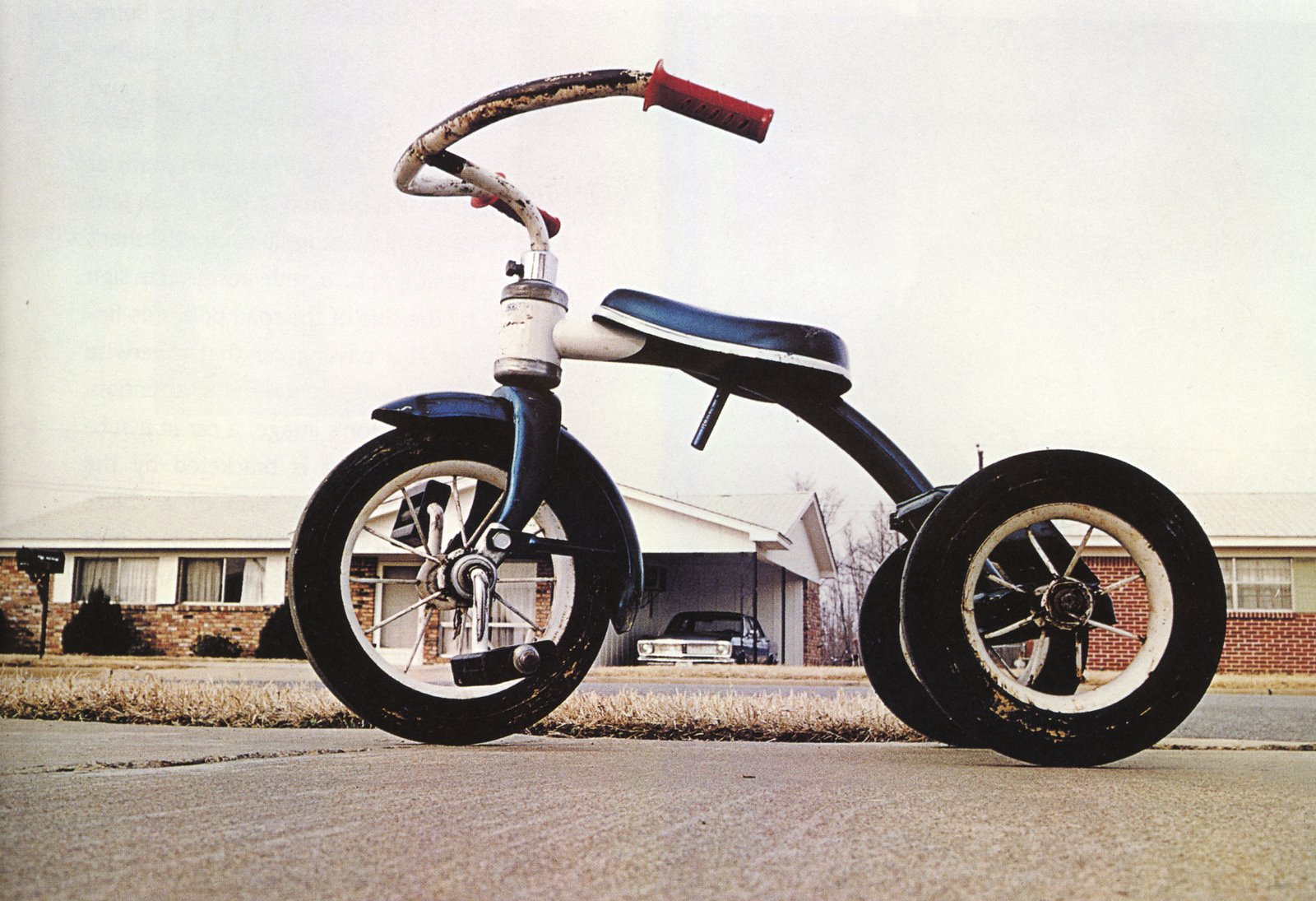
William Egglestone - Untitled, 1970

Friday, March 28, 2014

Exercise 5: Eye contact and expression

For this exercise, I was asked to set up a portrait session in which the face is prominent (and so perhaps head-and-shoulders or torso), and over the course of the shooting direct my subject to, at times, look towards me and away. 
The brief also asks to use a tripod in order to be able to talk directly to the subject without having to look through the viewfinder.

Giordano is simply unpredictable.
The sparkle of his creativity is always ready to lit his world of ideas and surprise everybody.
Born in Milan, he is another Italian working with me in Luxembourg.
Giordano, his humour, a bit British, a bit offbeat, always ready to depict a world to discover.
Giordano is a referee. 
Being a Torino FC supporter, I am persuaded that all referees, at least in Italy, are under the "spell" of Juventus FC. 
Giordano is the only person who could explain in depth and comment the details of the rules governing football. 
Thanks to Giordano I really understood how Juventus could win the last matches against Torino... 
Being a open minded and generous friend, he immediately accepted my request of help for this exercise and, after having discussed the brief, we started our session. 
I chose a neutral background, I set up my tripod and my camera and I started to shoot. 
I have to admit that I was was rather at ease with Giordano and we started to speak about our lives. 
Trivial and deep concepts were addressed all wrapped in the reassuring noise of the shutter release of my camera. 
After a while, I understood that the only thing that was "disturbing" us was the tripod. A sort of foreign body between us. 
Therefore, I decided to start shooting without it and I really enjoyed the regained freedom and dynamism of my movements. 
In my view the results are self explanatory: Image 3, 4 and 8 are taken without the tripod and in my view are the three best pictures of the series. 
More spontaneous, dynamic, intense. The touch of the photographer is there, I can feel my presence, there, with Giordano. 

During the shooting I tried to ask Giordano to pass me on different expressions. 


EYE CONTACT.

Image 1.


f 5.6, 1/4 sec, ISO 200, 55 mm 

Image 2.


f 5.6, 1/60 sec, ISO 3200, 55 mm  

In Image 1 Giordano is sort of gobsmacked, while in Image 2 he is surprised. 
Technically, the two photos are similar with side light and the same background. 
The only thing I decided to change is the shutter speed ( 1/4 sec and 1/60 respectively) and therefore the ISO to balance the change. 
Image 2 seems to me technically better. 

Image 3.


f 5.6, 1/45 sec, ISO 1600, 24 mm 

Image 4.


f 4.5, 1/45 sec, ISO 1600, 18 mm 

As already mentioned, Image 3 and 4 are taken without tripod.
I like them more than the first two.
First of all, I naturally got closer to my subject and I managed to grab his intense look.
Second, my presence was clearly perceived by the subject who, consequently, is less formal.
Therefore, he does not pose for me, he is with me.
The eye contact is more intense, in a way more sincere.


AWAY.

Image 5.


f 5.6, 1/6 sec, ISO 200, 55 mm  

Image 6.


f 5.6, 1/60 sec, ISO 200, 55 mm   

Image 7.


f 5.6, 1/60 sec, ISO 200, 55 mm   

Within the "Away" series, Image 5 is supposed to depict astonishment, while Image 6  and 7 are respectively authority and doubt. 
All three are taken with the help of a tripod. 
The last two have been shot with a flash. 
I believe that the flash helped to fill in the light of the portrait and considerably improved the result of the portrait. 
Personally, I also appreciate the the vertical, very graphical lines in the background. 

Image 8.


f 5.6, 1/45 sec, ISO 1600, 28 mm  

Image 8, taken without the tripod, is a sort of mystical vison: Giordano's Conversion on the Way to Damascus. 
Personally, I like the light, the look, the perspective. 

I very much enjoyed this exercise too.
Despite the fact that this kind of photographic activity is rather far away from my usual street photography way to take photos, I enjoy to share my passion with friends like Giordano and I really appreciate the outcome of the exercises.

Wednesday, March 26, 2014

Exercise 4: An Active portrait

The fourth exercise asks first to discuss with the subject what kind of natural activity he or she would be interested in, and whether this would be indoors or outdoors, sedentary or moving about.
Then, the aim is to execute a portrait exercise concentrating on the person and the facial expression.

Chloé and her mother Koidu are two friends I met a couple of years ago in the French city of Metz.
Koidu is Estonian and Chloé is half French and half Estonian.
As Koidu is a photographer, she and Chloé accepted with enthusiasm my proposition to help me for this exercise.
"What is your favourite activity Chloé?"
"What a silly question, Marco! You know I adore dancing! I have been doing classic dance since the age of 5 and I train 4 times a week every week".
She smiles at me, with her shy, but determinate approach while she explains that, besides classic dance, she also performs jazz and modern dance.
She is proud when she informs me that she even created her own choreography and she teaches dance to beginners.
"And why do you like dance?"
"Dance is beauty, art, expression. It allows me to improve myself, passing my limits, creating and expressing myself."
Chloé is a teenager, but she address herself to me with clear ideas, with the passions that only the best can have.
"... and what do you not like in dancing?"
"The physical effort, the pain in my muscles when I get punished for a mistake. It is hard, but dancing is so beautiful!"
"Let's go shooting Chloé and... merci!"

Image 1.


f 6.7, 1/180 sec, ISO 200, 18 mm

Image 2.


f 4.5, 1/250 sec, ISO 200, 20 mm

In Image 1 and 2 I like a lot the contrast between the background and Chloé's light posture.
I have to admit that, as it was very difficult to decide which one of the two similar photos I wanted to post, I chose to select both. 
In Image 1 I like very much the fact that Chloé's hand is cut (which probably could be considered a gross mistake in a formal portrait).  
This peculiarity makes me feel as the subject is flying away, out of the frame of my photo, free like a bird. 
I also like the line on the wall behind her body that is almost parallel to her body and seems to follow through her movement. 
In Image 2 I appreciate Choé's smile, but I do not like her hands which are blurred. 
However, this is one of the few smiles she gave me during our shooting and it looks very genuine. 

Image 3.


f 8, 1/180 sec, ISO 200, 31 mm

In Image 3 I do not like very much the background. 
The sky is almost burned, the trees and the houses are really not very interesting.   
However, I consider the facial expression and the look as very representative of Chloé's dancing effort. 
I also like her posture and I find it very typical for a classical dancer. 

Image 4.


f 9.5, 1/350 sec, ISO 200, 18 mm

The hand, the eyes and the trees made me select Image 4: her dreaming expression, the arm stretched with a soft movement and the tree branches that almost embroider the sky in the background. 

Image 5.


f 8, 1/180 sec, ISO 200, 21 mm

In my view, the red socks and jacket are the strong points in Image 5. 
I like the visual impact of this two strong coloured details that are rather uncommon for a classical dancer. 
Moreover, I appreciate the movement recalling the lines of the branches in the background. 

Image 6.


f 4, 1/10 sec, ISO 200, 24 mm

I selected Image 6 for the look and the background. 
A sort of dialogue between Chloé's eyes and the white, old, broken chair in the background. 
I find this an interesting narrative. 
What I do not like is the fact that I completely lost the reference to the activity I wanted to depict in the portrait: dancing. 

Image 7.

f 6.7, 1/125 sec, ISO 200, 38 mm

Image 8.


f 5.6, 1/90 sec, ISO 200, 31 mm

Image 7 and 8 are taken during the same series of shots. 
The first one is almost a cliché. 
The young classical dancer under a willow tree with a thoughtful look and a very poetical touch. 
I like it because, despite it is a bit sentimental, in my view it depicts very well the young Chloé and her view of life. 
The second shot is by far my favourite. 
I perfectly know that a portrait that does not show what is supposed to be its subject will unlikely win a prize and that, probably, it can hardly be defined as a portrait, but I strongly believe that this is the best picture I took of Chloé. 
First of all, I like the perspective: top down view with very interesting lines drawn by the thin willow branches. 
Then, the colours and the different degrees of green in contrast with the dark hair and the white skin. 
And finally the very poetical position of the hand taking the branches and almost caressing them. 
In post production I adjusted the curves in order to add contrast and drama to a photo that I consider to be very original.     

I enjoyed a lot this exercise and I felt much more at ease with Chloé than with Nicola (my subject in exercise 3) despite he is a close friend. 
I believe two are the main reason for that: 
1. I am getting more and more confident in managing my subjects. 
2. As Chloé is used to play the role of the photo subject with her mother she was an excellent model and often even suggested me interesting solutions for our photo session. 

Saturday, March 15, 2014

Exercise 3: Experimenting with light

The third exercise asks to use the same person as a model and take between four and six standard head and shoulders portraits that are very different in lighting effect.
I have to find locations in which the light varies and is suitable for taking a portrait photograph.

For me Nicola is Bari, or "La Bari" as he would say.
Bari is the third largest city in the Southern part of Italy and it is known for its sunny weather, its food and its great people.
I have been working with Nicola for the last 7 years and we became friends despite the alleged rivalry between people from North and South of Italy (I was born in the Northern city of Turin and I always had more friends coming from the South than from the North).
The best words that could define Nicola is "generosity" and "football".
Counting on his first characteristic, I decided to ask him to help me for my exercise and of course he answered enthusiastically.
However, it was not easy!
I consider myself a street photographer and, frankly speaking, I am used to take pictures of people.
I do not like to steal photos and, therefore, I know very well that the relation with the subjects is key for a good shot.
Generally, I speak with them, I explain my project, I share a bit of my life, of my feelings, of my artistic desires and I listen to them and I try to understand their approach.
Everything can be quick, few words, few glances or it can end up in a long chat.
Photography is discovery and I like it for this.
As I know him well, I thought that with Nicola the task would have been easy, but taking his portrait was not.
I had to play a role that I never played before: to be a professional photographer.
During the different sessions I had to learn to choose the right location where to shoot, how to lead him fighting with technical constraints and always thinking at the final goal of the exercise.
Nicola was very patient and cooperative, but definitely I was not at ease and, above all in the beginning, I lacked of leadership.

I decided to split the exercise in two: outside and indoor shooting.
For both I decided to have three different situations where the light was hitting my subject in front, laterally and from the back respectively.
The photos were taken in a rare sunny week here in Luxembourg in the financial area of Kirchberg during our lunch breaks.
All the images were slightly corrected with PS in post-production: histogram, curves, brightness, saturation, contrast and vibrance.


OUTSIDE.

A. Front light.

Image 1.


f 8, 1/750 sec, ISO 200, 21 mm

Within the technical constraints given by the brief, I tried to get the "real" Nicola's characteristics across the image I produced.
So, no need to say it, in Image 1 he wears the Bari football team scarf.
I like the perspective of this shot and, of course, the contrast between the scarf and the suit.
"Bari, you will never walk alone."

Image 2. 


f 4.5, 1/2000 sec, ISO 200, 18 mm 

"What am I doing here?" seems to say this photo which is representative of a general state of mind that, particularly the first day, Nicola an I had during the shooting.
I like a lot his genuine facial expression and the very graphic background.

Image 3. 


f 11, 1/350 sec, ISO 200, 55 mm

"Make love to the camera!"
The third shot of the sequence reveals the Italian charm that naturally Nicola expresses in his gesture.
Of course, it is a sort of stereotype, but I believe that also Image 3 is well representative of one of the major characteristics of Nicola's attitude.

B. Side light.

Image 4.


f 8, 1/750 sec, ISO 200, 18 mm 

I appreciate the sincere look and the little cunning smile in Image 4.
I slightly cropped the photo in order to reframe it with PS.
I believe that a less centered portrait and the lines in the background give a bit more dynamism to the picture.

Image 5. 


f 9.5, 1/750 sec, ISO 200, 18 mm

Again another typical Nicola's facial expression. I know what it means, but I can not translate it.

C. Backlit.

Image 6.


f 16, 1/180 sec, ISO 200, 18 mm

Image 6 is intended to show the benefit of using flash in an outdoor daylight situation. 
Nicola was intentionally backlit and this can cause problems getting the correct exposure. 
Often, if the face is well exposed, the background details are lost. 
Or otherwise the strong backlight creates dark shadows across the face. 
Probably my location is not particularly brilliant to demonstrate this, but the background detail has not been lost and the flash has produced a clear view of his face.


INDOOR.

A. Front light.

Image 7.


f 4.5, 1/45 sec, ISO 200, 18 mm

Image 7 enjoys a diffused daylight. Soft bright light diffused by a large window. 
Contrary to the previous photos taken outside, the light is rather soft and bright in this image. 
The lighting and background have created a gentle looking portrait. 

B. Side light.

Image 8.


f 8, 1/500 sec, ISO 200, 18 mm

What I like about this type of lighting is the added drama it can create but there is the danger of losing too much detail in the shadows.
The face has depth and form creating character by showing some wrinkles.
I simply adore the expression on his face.

C. Backlit.

Image 9.


f 4, 1/90 sec, ISO 200, 21 mm

In Image 9 the light was very bright on a typical head and shoulders portrait.
This is the only shot which was a bit more heavily modified in post production.
I decided to highlight the contrast between the milky, almost paradisiac background, and Nicola's "evil" expression.
Therefore, I increased the brightness in order to have almost a totally white window and the contrast in order to better see the face.
I like a lot the result particularly for the framing and the sort of white arrow above his head.

Exhibition - "Izis, il poeta della fotografia" (Izis, the poet of photography)

At the "Spazio Oberdan" in Milan I had the pleasure to visit the exhibition of Izis Bidermanas (1911-1980), better known as simply Izis.
The Province of di Milano and the Alinari's Foundation in cooperation with Ville de Paris (Paris City Council), presented the collection of one of the most important humanist photographer of the XX century.
Born in Marijampolė, present-day Lithuania, Bidermanas arrived in France in 1930 to become a painter. In 1933, he directed a photographic studio in the 13th Arrondissement of Paris. During World War II, being a Jew, he had to leave occupied Paris. He went to Ambazac, in the Limousin, where he adopted the pseudonym Izis and where he was arrested and tortured by the Nazis. He was freed by the French Resistance and became an underground fighter.
Izis became a major figure in the mid-century French movement of humanist photography — also exemplified by Brassaï, Cartier-Bresson, Doisneau and Ronis — with "work that often displayed a wistfully poetic image of the city and its people".
For his first book, "Paris des rêves" (Paris of Dreams), Izis asked writers and poets to contribute short texts to accompany his photographs, many of which showed Parisians and others apparently asleep or daydreaming. The book, which Izis designed, was a success. Izis joined Paris Match in 1950 and remained with it for twenty years, during which time he could choose his assignments.
Among the numerous books by Izis, Gerry Badger and Martin Parr have especial praise for "Le Cirque d'Izis" (The Circus of Izis).
Shot mostly in Paris but also in Lyon, Marseille and Toulon, the photographs are "affectionate and nostalgic, but also deeply melancholic" with "a desolate undercurrent", forming a work that is "profound, moving and extraordinary".

The exhibition “Izis, il poeta della fotografia” showed a selection of about 140 photos.
I had the opportunity to discover the intense activity of this photographer who depicted "the dream" with his poetical style that I very much appreciate.


"Homme aux bulles de savon". Petticoat Lane, Middlesex street. Whitechapel, 1950.

This shot was one of the photos shown in the brochure advertising the exhibition and I believe it is indeed one of the most representative of the style of Izis's style.
I simply adore the oneiric atmosphere and the contrast between the (old) man and his gesture typically associated with a child's activity.
The light soap bubbles are also in contrast with the heavy and dark background and cloudy sky.
In my view, the depth of field that leaves the background out of focus plays also a fundamental role in the success of this photo.
Great shot that well deserves to be shown in the presentation of the exhibition.


"Fête", Place de la République, Paris,1950

Here I very much appreciate the frame, the diagonal cut that gives such a sense of freedom.
I can almost feel my stomach going wild with the movement of the carousel and hear the two ladies screaming while their hair fly in the air with their terrified bodies.
Again, in my opinion, the flat background in a cloudy sky gives to the image a sort of oneiric touch, like a timeless instant.


"Carnaval de Nice", Nice, 1956

In this photo I definitely like the narrative.
Who is this boy? Why his body is so tense? Why does he keep the mask and the bag of confetti so gripped, almost hiding them? Did he steal them? Or did somebody want to steal them from him?
The questions are unanswered because the photo is tightly cropped on the boy and the viewer can only remain with the taste of its mystery.


"Sur les quais de la Seine", Petit Pont, Paris, 1954

I believe that the perspective of this shot is absolutely very innovative for the time it was taken.
First of all, it is a very interesting view of a resting body that almost melts itself with the architecture around. 
I needed few seconds in order to understand where was the head of the woman and get the right angle.
Izis takes my look and brings it around this picture like a journey to the discovery of amazing details: the shoes, the pantyhose, the stain on the knee, the "graphic" shadows, the overall position of the body...
Second, I think that he goes very far into an intimate look considering the fact that the shot have been taken in the '50s. And I personally appreciate very much his brave, intimate and intense look.


"Saltimbanques", Lagny, 1959

I personally adore lines!
Lines, ropes, cables, anything that can cut a photo fascinates me.
I like delimitation of spaces, the creation of different areas of visual space that can make a photo extremely attractive.
The lightness of this shot is simply fantastic and this is why it is one of my favourites.


I enjoyed very much this exhibition because, even after 60 years, Izis's photos, with their sharp cut of light and their particular sensibility to the atmosphere, still express a great deal of poetry.
He is definitely a fascinating artist, marked by the difficulty of the exile and by the war, but who kept intact his purely poetic nature.
His photographic style is intuitive, direct and oneiric and, among the humanists photographers that I know, he is one who better managed to allow the viewer from reality to dream.


Sunday, March 9, 2014

Exercise 2: Thinking about location

This exercise asks me to play the role of a location hunter.
The brief is to find six very different settings or backgrounds which could be used effectively and attractively for either a whole body or torso portrait.
First, I am supposed to take reference pictures of the locations, without people.
Finally, choose one of them and return with a portrait subject and photograph them.

Following Exercise 1, where I took Matteo, my younger son as subject, I have been repeatedly accused to be unfair vis-à-vis of Max, my older boy. Therefore, in order to reestablish an equal treatment and my reputation of Solomonic father, I decided to take Max as subject for this new exercise.

As a first attempt, I tried to find a peaceful background, a sort of bucolic imaginary place where a young boy could find himself at ease and express his nature at best.
Looking on the border of the Moselle river, I found the place I was looking for in the first fantastic day of spring.

Image 1.


f 11, 1/90 sec, ISO 200, 18 mm

The little French heaven with its long charming shadows looked interesting, but rather distant from Max's nature. I am not sure this set would fit to my subject.

So I tried to find a place with a minimum of photographic charm that could fit better to a nine years old boy. And I found my second possible location.

Image 2.


f 11, 0.3 sec, ISO 200, 34 mm

I like this shot for few reasons.
First of all the light which gives a sort of theatrical atmosphere to the kicker, which is, in itself, a very simple object.
The kicker, representing an old fashion toy, is still very much loved by my child.
The location, a sort of cave, underlines the fact that children can enjoy despite the basic location.

Going forward on this "minimalist" wave, I found my third possible location.

Image 3.


f 4.5, 1/15 sec, ISO 200, 18 mm

I believe it could be interesting to have a strong contrast between the young boy and such a background.
The narrative of such a photo could raise several questions in the viewer's mind.
Where is the child? Why is he playing in such a location? And according to his facial expressions: why is he happy/sad? 

Coming back to the nature of my subject I thought that a playground could be a natural location for Max's portrait.

Image 4.


f 22, 1/500 sec, ISO 4000, 24 mm


f 22, 1/40 sec, ISO 125, 70 mm

I consider the portrait and the location interesting (that's the reason why I post both), but still a bit to "easy" and not very original. 
Moreover, technically, I do not find the shots very fine due to the excess of light and movement. Probably I should have taken a quicker shutter speed.

Image 5.


f 8, 1/250 sec, ISO 125, 24 mm


f 8, 1/250 sec, ISO 100, 24 mm

Max himself suggested the location depicted in Image 5.
It is a hill few minutes walk away from our house where he often enjoys playing with his brother during our Sunday's afternoon usual walk in the nature.
Despite to fact it is a very simple place, they spend long moments of leisure there and, after having explained him the aim of my photo exercise,  he told me that his portrait could very well fit this location.
Of course I like this shot for this reason and I think it is worth to post not only the location, but also the final portrait.

Image 6.

My final choice went back to a rather neutral background: a fireplug in the city centre of the French city of Metz.
I believe that the tonal and textural simplicity is indeed a reliable quality of the location.
Moreover, in the portrait, the fireplug standing alone in the picture fits to Max attitude and expression. 
In my opinion, also his long shadow adds interest to the final shot.


f 11, 1/500 sec, ISO 200, 26 mm


f 6.7, 1/350 sec, ISO 200, 18 mm

I like very much this portrait of Max.
I am persuaded that it manages to show the inner nature of his character: his great sensitiveness and introspection that sometimes can seem to be introversion.