Saturday, July 26, 2014

Assignment 2: People and activity

The object of this assignment is to plan and execute a set of images of people in some form of meaningful activity. 
This could be work, sport, a stage performance (music, drama), or at a social event.
I am supposed to produce a set of approximately 10 final, selected images, and I can choose between depicting the same person (or small group) at different kinds of activity, or different people at the same single activity or event.
I am requested to concentrate especially on two aspects: on telling moments, and on ‘explaining’ the activity (which means choosing viewpoint, framing and timing to make the actions as intelligible as possible).
In my learning log:
• Critically assess my finished work. Consider each piece individually.
• Identify what has worked well and what has been less successful and analyse the reasons for this.

With its 25,000 spectators every year and more than 50 jazz and blues acts performed across 11 open-air stages and in 12 cafés and restaurants in the lower part of the capital during the course of the evening, the "Blues'n Jazz Rallye" is considered to be one of the most popular event in Luxembourg.
This year the evening had a dry and steamy weather, the streets and squares were teeming with life as people socialised and danced along to the free live acts at what was the 20th edition of the event.
My plan was to shoot the event as a street photography exercise, looking for colour and action, including some occasional candid portraits.  
The brief asked for images that explain the activity and for telling moments; I will explain how I feel the images I have selected meet these needs in the notes accompanying each photograph.
I believe that what worked well was my choice of the event and therefore my overall photographic work. 
During the evening I took a total of 717 photos in about 4 hours (from 6 p.m. to 10 p.m.) of shooting session. 
The evening was rather warm, around 25-28 degrees, but overcast with occasional sun resulting in very varying shooting conditions, any shots including the sky blew out and I was forced to reject some good moments as too much white invaded the frame. 
A very important aspect of the event that I had anticipated and that was successful was that it was very participatory, anyone could join in and march, including photographers, therefore I was able to get very close to the bands. 
Obviously, this enabled me to capture images at a wide range of focal lengths and often to explain my work to the participants exchanging our point of views and different artistic experiences.
What really did not work was a major mistake that I did and that, after few years of photography, I am almost ashamed to confess.
Before leaving for the session, I completely forgot to check the batteries of my camera and when I arrived at the event I realised that my batteries were half empty.
Luckily, I had with me my old Pentax and I managed to finish my last hour of work with that.
This mistake impacted the result of my shooting in terms of quality, as my Pentax is definitely less performant than my Canon (see Image 8 and 9).  

Image 1.


f 2.8, 1/80 sec, ISO 250, 70 mm 

Image 1 reminds me about the first stanza of William Blake's poem "The Tyger":
"Tyger! Tyger! Burning bright 
In the forests of the night, 
What immortal hand or eye 
Could frame thy fearful symmetry?" 
I like the movement of the singer, voluptuous and very feminine, soft like the movement of a tiger in the forest.  
I also appreciate her cycloptic eye: black, intense and dream-full.
And I find very interesting the allegedly "fearful symmetry" given by the lines in the background.

Image 2.


f 2.8, 1/40 sec, ISO 125, 48 mm 

In order to shoot Image 2 I had to climb behind the stage of this band and I was lucky enough to manage without being courted by the security service.
I think that the perspective "from behind" is rather interested, but what I really like is the black veiled stage effect.
In particular, I think that the grain of the veil and its horizontal line at the bottom give a special charme to the image.

Image 3.


f 3.5, 1/50 sec, ISO 100, 28 mm 

Rarely I laughed so much during a photo session!
While on the stage a band full of energy was trying to draw the audience into a hard rock trip, this drunken funny guy was dancing in front of them catalysing everybody's attention.
I adore his very original and funny dress, his chicken posture and, of course, the contrast between him and the very cool band in the background. 
I am not sure about the effect of the strong spotlight on the top, but I decided not to correct it because, even if it could distract the viewer, I considered it an important part of the scene adding drama to the stage.

Image 4.


f 4.5, 1/125 sec, ISO 100, 55 mm 

Taking this photo from behind was easier than taking Image 2 as this band was playing its energetic jazz on a sort of round platform in the middle of the street.
I like the very casual look of this middle-aged British drummer (I know he is British because I spoke with the band before they started their concert).
I also appreciate his hat, worn with nonchalance despite the temperature, and his other spare hat just beside him, just in case...
Moreover, I think that the out of focus foreground and the free sky in the background in front of him give depth and a sort of serenity to the picture.   

Image 5.


f 4, 1/45 sec, ISO 400, 28 mm 

When I saw the stretched arm of the singer framed by the iron bars of her stage I simply had to shoot.
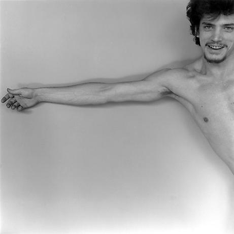
Her arm reminds me my favourite photo by Robert Mapplethorpe in one of his most famous self portraits (see my post dated 21 June 2014).
Clearly here the atmosphere is different, the saturation of colours, the quality of the subject and, above all, the quality of the photographer.
However, I feel that there is something similar in the gesture, in its intensity and lightness, in the expression of the moment, almost post-orgasmic instant.
Like in Image 1, I find also very interesting the frame given by the lines in the foreground.  

Image 6.


f 4, 1/45 sec, ISO 400, 18 mm  

Image 6 is supposed to depict innocence and (a sort of) failure.
The lower half of the image shows the innocence of a lonely child looking at the concert. 
His posture, the light and the colours are almost angelic and the blond young boy seems completely absorbed by the music and the atmosphere.
He is alone with his enchantment, nobody and nothing is around him.
The upper part of the photo shows the band playing deploying the maximum of technical and artistic effort to attract the audience. 
They even have a multinational sponsoring instruments and performance.
This is in a way their little failure: so much effort for only one spectator. 
But the boy really looked amused!   

Image 7.


f 3.5, 1/45 sec, ISO 400, 18 mm  

Jupiter, father of all gods replaces the head of this tuba player with his white halo of music and celebration.
I like the shot also because it reminds me a similar photo from Henry Cartier-Bresson (even if, here again, the quality of the photographers is clearly not comparable).
I like how the shot is framed and the nice contrast between the colours.
However, I do not think this is the best image of the series mainly because it lacks of narrative.

Image 8.


f 4, 1/60 sec, ISO 1600, 31 mm 

Image 9.


f 4, 1/45 sec, ISO 1600, 31 mm 

Image 8 and 9 have been taken with my old Pentax for the reason I mentioned above and, in my opinion, the quality of the photo is affected accordingly.
Contrary to my Canon which has a lens with an aperture of 2.8, my Pentax is equipped with a lens which has only an aperture of 4 and in the evening I had to increase the ISO to compensate the lack of light.
Therefore, I think that both images suffer of a high level of noise due to the high ISO (1600) I had to use.
I tried to correct this issue in post production, but I think that the result is still not good enough.
However, I like very much both images for their narrative: the humanity of the look of the funny bearded tuba player and the intensity of the trumpeter.
I also think both photos are interestingly framed. 


Tuesday, July 15, 2014

"The Photograph as Contemporary Art" - Chapter 4: Something and Nothing - Learning points

The course material includes also "The Photograph as Contemporary Art", a very interesting book written by Charlotte Cotton published by Thames and Hudson (London 2014 Third edition). As I decided to do for my practical course, I would like to keep track of my learning points as I gradually go on reading the book reporting the most important sentences by the above author.
No copyright infringement intended - photographs will be removed immediately upon request.

The photographs in this chapter show how non-human things, often quite ordinary, everyday objects, can be made extraordinary by being photographed.
These photographs retain the thing-ness of what they describe, but their subjects are altered conceptually because of the way they have been represented.
Through photography, quotidian matter is given a visual charge and imaginative possibility beyond its everyday function.
The iconography for this strand of photography includes objects balanced and stacked, the edges or corners of things, abandoned spaces, rubbish and decay, and fugitive or ephemeral forms, such as snow, condensation and light.
There is no such a thing as an unphotographed or unphotographable subject.
This strand of photography has been driven by related attempts to make art from the matter of daily life, by breaking the boundaries between the artist's studio, the gallery and the world.
Rather than asking how and by whose hand the work of art was made, the question becomes: How did this object come to be here? And what act or chain of events brought it into focus?

Peter Fischli and David Weiss in their Quiet Afternoon series show table-top assemblages of mundane items that seem to have been found close at hand in the artists' studio.
They created sculptural forms by fixing and balancing these objects together and then photographing them against dull backgrounds with raking shadows, lending a comic drama to their consciously unsophisticated temporary sculptures.


Peter Fischli and David Weiss - Reibeisen Mit Karotte Und Zucchini, 1984-1985

Gabriel Orozco's art is full of impossible, witty and imaginative games. 
Whether in the form of photographs, collages or sculptures, or as an animated conversation between these mediums, his installations and exhibitions display work that, with a remarkable economy of means, offer exciting and playful conceptual journeys.
In his Breath on Piano, on one level the photograph can be seen as the documentation of the highly fugitive act of breathing onto the seamlessly shiny surface of the piano top.
On the other, it makes us see the image as image, as forms on a surface, which is a fundamental condition of a photographic print.


Gabriel Orozco - Breath on Piano, 1993

For more than thirty years, British artist Richard Wentworth has photographed the sign and debris of urban streets.
The objects are often redundant from their original function, reused or abandoned, and through photography they gain new, sometimes comic characterisations.


Richard Wentworth - King Cross, London, 1999

German artist and director Wim Wenders uses still photography when a site carries its own story and does not require him to construct one cinematically.
In Wall in Paris, Texas the cracks in the road and the plaster on the side of the building that has fallen away to reveal the brickwork beneath create an allegory of the deterioration and fragility of the place, emphasised by the fraught diagonal lines of the power cables dissecting the image.


Wim Wenders - Wall in Paris, Texas, 2001

Tracey Baran's highly sensual photograph, Dewy, of an etched glass still wet with moisture and placed on a widow sill, light falling onto it through foliage, is a classic still life.
The sense of physicality in this uncontrived combination of planes and forms is delicately mapped.


Tracey Baran - Dewy, 2000

Jeff Wall's Diagonal Compositions no. 3 may at first seem to be an unusual work for him because of the absence of a cast of actors or impressive mise-en-scène.
Wall's careful construction of a grouping of peripheral things prompts questions about our own relationship with photographs: Why are we looking at this? At what point in history and our own lives did a corner of a floor represented in a photograph become iconic, worthy of our attention?
To what degree does it need to be abstracted by the seemingly innocent frame in order for us to recognise this grouping of non-subjects to be still life?
The beauty of Wall's photography is that, while it raises these complex questions, it still satisfies us a works of art.


Jeff Wall - Diagonal Composition No. 3, 2000

German artist Uta Barth's series Nowhere near pares down its subject matter to the spaces between things.
Here she focuses on a window frame and the view beyond, whose blurred forms mark the boundary of what is outside the photograph's visual range.
Thus we are made hypersensitive to what we edit out or do not look at, and so do not define as a subject or a concept that can be seen.


  Uta Barth - Untitled, Nowhere Near (nw 6), 1999


Monday, July 14, 2014

Thomas Ruff - "Dermatological realism"

Thomas Ruff is one of Germany's best known living photographers.
His roots are in the objective photography of Dusseldorf school. This was a group of photographers who were taught in the late 1970's and 80's by Bernd and Hilla Belcher and included photographer Andreas Gursky, Candida Hofer, Thomas Struth, Angelika Wengler and Petra Wunderlich.
The Belchers are best known for their photographic series of industrial buildings and structures, and were linked with Conceptual Art, with their depiction of banal scenes with cool detachment.
Ruff studied photography at the Dusseldorf Art Academy between 1977 and 1985.
Starting in 1981, he photographed passport-like portraits in black and white, subjects between 25 and 35 years old.
The images had the upper edge just above the hair, even lighting, solid colour backgrounds, while the individuals were shown with emotionless expressions, sometimes face-on and sometimes in profile. After 1986, he began to experiment with large-scale printing, producing images up to 2 by 1.5 meters.
The following year he settled on his format of a full frontal view and balancing any dominating colour by using a light and neutral background.
By appropriating this passport-style portraiture of young people with dead eyes and empty faces, he denies ability of the photograph to convey deep emotions of the sitter. 
Instead, by the use of scale, the portraits are only able to express the superficial, the surface of the subject, because as a viewer we become involved in the detail, looking at every pore, hair and blemish. 
Thus Ruff posits a photographic objectivity in the formalism of his approach with the monumental physical presence and deadpan rendering which overwhelms the individual personalities of those portrayed.
His subsequent series "Other Portraits", which enabled him to construct artificial faces from the combined features of men and women, exposed photographic objectivity to be a fiction. 
The success of the series were to consolidated his international reputation and give him the financial freedom to work on subsequent series of photographs. 


Portrait (P. Grote), 1986


Portrait Nr. 56/4, 1994

For me, it is the intensity of the gaze, both male and female which makes them such captivating and yet alarming portraits in their objective approach. 
They are and will be very influential to my approach to photographic portraiture.
Ruff appears to be rehearsing Andy Warhol’s deadpan Polaroid aesthetic while presenting to the spectators of his pictures frontally posed, bust-cut head-and-shoulder color photographs.
These could have been taken inside a photo booth, had not Ruff decided to blow up his pictures – and with it the faces of his characters – to monumental sizes.
The monumental size introduced in art photography in the 1980s – partly on account of the renewed interest in the relation between photography and painting – was tied to the wish to provide photography with an aura similar to that of painting.
The closer I came to Ruff’s huge portrait, the better I saw the details of the face but the less real the model seen as a person looked to me, increasing rather than diminishing the distance.
Ruff’s photographs look like photos for an identity card, that is identification photography, which presents measurable features rather than expressing personal identity, but the photos are sized like for an advertising board or political propaganda, other genres which also lack intimacy.
Contrary to the expectation with regard to a portrait to express personal identity, Ruff’s portraits emphasise that this is not possible.
Ruff himself explained that: “I have no interest to show my interpretation of a person. I depart from the idea that photography can only show the surface of things, the same goes for portraits”.
Personally, I appreciate and see were Thomas Ruff is coming from, what and how his peculiar style communicates.
However, what I look for in a work of art (and specifically in a fine art photograph) is "artist heat".
Being very direct, I really need to feel more passion and some warmer feelings than what Thomas Ruff expresses with his giant portraits.


Portrait (S. Weirauch), 1988

"Thomas Ruff's words amount to an ironic polemic against arbitrary interpretations of his photographs, and he likewise challenges the general availability of all things visible.
From the mouth of a pupil of the Düsseldorf Academy of Art this comes as no surprise.
Bernd and Hilla Becher, who teach at the latter institution, have promulgated a way of photographing architecture that is based on strict photographic realism, and in so doing have founded a veritable school.
But 'accepting a picture as a picture' neutrally, dispassionately and without passing judgment – that is no easy matter.
Thomas Ruff's portraits are unsettling simply on account of their immense scale.
Every detail, every pore, every pimple on these large-size faces is visible.
We would never stare so brashly at a living person.
Ruff's photographs dispense with this barrier of modesty.
We stare at the persons photographed – and they stare right back.
However, their distanced gaze in the pictures does not infest us.
On the contrary, it awakens our emotions.
We like or dislike the characters.
Some faces appeal to us, others less so.
And then we begin to think about who these people could be.
What are their occupations? Where do they come from? What is the story behind them?
Man is, by nature, curious.
We want to know what is hidden behind the facade, and a face is in a sense a facade." ("Dermatological realism" - DBAG website).


Portrait, 1988


Part two: People unaware - Learning points

The idea behind the "street photography" is to explore on foot, photographing life on the pavement, in open-air cafes, markets, parks and so on.
Nothing is pre-planned; the photographer relies completely on his powers of observation and anticipation, and on luck, to find interesting images from ordinary situations.
The emphasis is on three things:
1. being unobtrusive
2. spotting potential pictures in advance
3. shooting quickly with the camera's automated settings

The methods tend to divide between being unnoticed on the one hand and gaining trust and permission, if only implicitly, on the other (personally, I use the second method).
In un-posed photography, in which the subject is unaware, the people in front of the camera present a fluid situation.
They move, act and interact, all without guidance.
Inevitably, in any given scene that is framed, certain moments will simply make a better-looking image than do others.

The great French reportage photographer Henri Cartier-Bresson coined the phrase 'the decisive moment' to describe this key quality in a photograph.
In his 1952 book of the same name, he defined it as ‘the simultaneous recognition, in a fraction of a second, of the significance of an event as well as the precise organisation of forms which gives that event its proper expression'.
The moment normally hinges on what the subject is doing – the most striking expression, or action, or gesture – but in other situations it may depend more on how the photographer chooses to frame the composition.

Longer focal lengths make for objective 'across-the-street' compositions, and separate the photographer from his subject, both physically in distance and in the sense of involvement.
Depth of field is relatively shallow, making accurate focusing important, but with the camera set to auto-focus this is usually not a problem.

A wide-angle lens has two valuable functions: it places the person firmly in their surroundings, and it draws the viewer into the scene.
In a situation in which there are people moving around with a wide-angle lens the photographer will be taking in much of the immediate surroundings, as in order to partly fill the frame with a figure, he will typically be shooting from a few or several feet away.
This naturally makes him fairly obvious to passers-by, and one problem is having someone who is not the subject in frame and staring at the camera.
The way to avoid this is to raise the camera only immediately before the shot, then lower it. Alternatively, simply wait it out, or even briefly lower the camera, glance to one side so as to divert their attention, then shoot.
The photographer is clearly in the middle of things, a style sometimes known as 'subjective camera', that conveys a sense of being there and of activity.

The concept of ‘standard’ and ‘normal’ in lens focal length is that the view approximates to what the photographer would see with the naked eye.
In street photography, ‘standard’ means non-insistent, with no special graphic distortion applied to the picture.
On the one hand, this means that the photographer does not have the benefit of a graphic strength to help the images, but on the other hand, the sheer normality of a standard focal length keeps the attention firmly on what is happening in the scene, without distraction.
There is no need to think about the special difficulties of working either at a distance or very close.


Sunday, July 13, 2014

"The Photograph as Contemporary Art" - Chapter 3: Deadpan - Learning points

The course material includes also "The Photograph as Contemporary Art", a very interesting book written by Charlotte Cotton published by Thames and Hudson (London 2014 Third edition). As I decided to do for my practical course, I would like to keep track of my learning points as I gradually go on reading the book reporting the most important sentences by the above author.
No copyright infringement intended - photographs will be removed immediately upon request.

The third chapter focuses on the deadpan aesthetic: a cool, detached and keenly sharp type of photography.
The emphasis is on photography as a way of seeing beyond the limitations of individual perspective, a way of mapping the extent of the forces, invisible from a single human standpoint, that govern the man-made and natural world.
The deadpan became popular in the 90s, especially with landscape and architectural subjects.
The deadpan we see today is often characterised as "Germanic". This moniker refers not only to the nationality of many of the key figures but also to the fact that a significant number were educated, under the tutelage of Bernd Becher, at the Kunstakademie in Düsseldorf, Germany.
Albert Renger-Patsch, August Sander and Erwin Blumenfeld are the most mentioned forefathers of today's deadpan photography.

Andreas Gursky adds to his oeuvre with each satisfyingly complete picture, rather like a painter does, so every photograph he releases has a good chance of contributing to the high reputation enjoyed by his work asa whole.
He works within connected themes and releases photographs that stand as discrete visual experiences.
His immaculate consistency is an undeniable element of his commercial and critical success.
Gursky often places us so far away from his subjects that we are not part of the action at all but detached, critical viewers.
What we are given is a mapping of contemporary life governed by forces that are not possible to see from a position within the crowd.


Andreas Gursky - Chicago Board of Trade II, 1999

The German artist Matthias Hoch's typology of contemporary life has typically centred on architectural detail and interiors.
In Leipzig #47 there is an evident sense of geometry and mapping.
The light emanating from the screen flattens the poles in the foreground, emphasising the nature of the space that determines the subtle drama of the scene.


Matthias Hoch - Leipzig #47, 1998

Jacqueline Hassink applied to photograph ten rooms in a hundred American and Japanese corporations (including the CEO's home offices, archives, lobbies, boardrooms and dining rooms).
The refusals and acceptances Hassink received feature on a graph that accompanies the photographs of the rooms to which she gained entrance.


Jacqueline Hassink - Mr Robert Benmosche, CEO, Metropolitan Life Insurance, NY April 20 2000, 2000

Alex Hütte introduced a new element to his deadpan photography in the mid 90s with a series of photographs of cities taken at night with long exposure times.
These photographs are presented as transparencies held in front of reflective surface, creating a glistening effect in the illuminated areas of the image where the mirror-like backing is visible.


Alex Hütte - The Dog's Home Battersea, 2001

For more than thirty years American photographer Richard Misrach has created numerous bodies of landscape and architectural photography, with a particular focus on the American West and the tradition of its representation.
His political and ecological views come through his images of sites in the aftermath of landscape devastation and man's destruction of natural resources.


Richard Misrach - Battleground Point #20, 1999

What interests John Riddy is photography's capacity to conflate time and its ability to evoke the history of a space. 
In Maputa (Train), the turquoise paintwork and the benches become the fading signs of a moment in the place's colonial past.
Present time is shown in the train carriage at the centre of the image, an element we know will soon depart without a trace.


John Riddy - Maputa (Train), 2002

The chapter draws to a close by considering artists who use the depersonalised deadpan style in portraiture.
One of the most influential portrait photographers of the 80s was German artist Thomas Ruff.
Ruff began photographing head-and-shoulder images of his friends, reminiscent of passport photographs, although considerably larger in format.
He asked his subjects to remain expressionless and look straight at the camera.
At the same time as offering great detail in the sitters' faces, right down to the hair follicles and pores in their skin, the work's blank expressions and lack of visual triggers, such as gestures, confound our expectations of discovering a person's character through their appearance. 


Thomas Ruff - Portrait


Monday, June 30, 2014

Exercise 15: A public space

For this final exercise, I am supposed to transfer my attention from an organised occasion to a semi- organised public space.
Instead of a single event, there will be a variety of things happening, even if not all of it is particularly active or focused.
I am requested to try to capture the sense of varied use — how people make their own personal or small-group activities within the same general area.

Recently, I spent a couple of days at the Parc Animalier de Sainte-Croix (close to the French city of Strasbourg), a fantastic park of about 1,200 hectares where my kids enjoyed a very exiting holiday.
During that days spent in the nature I decided to take advantage of my free time in order to shoot the images for the exercise 15.
I considered the public space of such a park as a perfect and original location for this exercise.
I am rather satisfied by the quality of the photos that I selected amongst the about 500 shots I took.
However, I have to admit that I would have preferred to find more people and activity to photograph, but as the park was almost empty (we were there in the middle of the week and the school holidays in France have not began yet) I was obliged to take mainly the persons who came with me.

Image 1.


f 5, 1/100 sec, ISO 100, 24 mm 

"Here she is, papa!" 
I like Image 1 because it depicts the unbounded energy of a child in a park.
It goes beyond the photo, it passes through a two-dimensional image and it becomes a driving force that pulls the narrative of a shot.
Moreover, I adore the dirt on the hand sneaking into the photo. 
It clearly tells about the intensity of a day lived without saving a single drop of energy.

Image 2.


f 4, 1/100 sec, ISO 100, 45 mm  

The profile and the dress of the little girl sitting on her father's shoulders makes me think about Little Red Riding Hood.
Even more if I think that she is in front of a pack of wolves!
It is indeed a pity I did not have the reflex to change my f stop from 4 to 22 in order to have the animals on my shot.

Image 3.


f 9, 1/500 sec, ISO 100, 51 mm  

The heat and the fatigue were omnipresent.
Image 3 depicts the two.
I like the background and its colour enhancing the sense of heat, but I also appreciate the posture of the boy who is slowly and almost unconsciously getting rid of his rucksack. 
I think that also the wet t-shirt helps adding drama to the shot.

Image 4.


f 4, 1/80 sec, ISO 100, 45 mm  

Image 4 is not a strong image, but I think it has merit to well illustrate the major activity in such a park: looking and wonder.
The tourist (no doubt she one with such a dress!) looks at the dazzling landscape in front of her and I can almost perceive her wonder in her eyes.
I like the graphic, but not necessarily the light of this shot (the burned central stripe).

Image 5.


f 10, 1/400 sec, ISO 100, 34 mm  

This and the next are my favourite shots of this exercise.
Feet and shadows are the central subjects for both.
In Image 5 I like above all the shadows which play a sort of graphic design on the wooden floor and recall to me a game of embroidery.
I doubted long time during the post production regarding the clarity, vibrance and saturation of the image, particularly for the shadows.

Image 6.


f 7.1, 1/200 sec, ISO 100, 24 mm 

In Image 6, the combination of flashy colours, shadow and grey asphalt fascinates me.
The subjects are the same than the ones in previous image, but here I find the narrative stronger.
I think that the colours and the posture of the feet and the body in the shadow transmit a sense of movement, a kind of a soft "rave party" energy that I really like.
I also think that the light vignetting of the post production enhances the general feeling of the shot.

Image 7.


f 7.1, 1/250 sec, ISO 100, 37 mm  

Looking at image 7, I wonder what is more tiring: the heat or the endless run of the children? 
Probably both. And the photo witness both rather well.
I left intentionally the right part overexposed in order to stress this effect.

Image 8.


f 7.1, 1/250 sec, ISO 100, 24 mm  

I like this shot for its contrasts.
The colours, green and red; the wires, the headphones and the pipes; the dress in the heat.
I do not like very much the background (above all the concrete behind the lady), but this is a true quick street photography shot and I did not have the time to choose a better place.

Sunday, June 29, 2014

Exercise 14: An organised event

For this exercise I am requested to research, prepare in advance and look for an organised event at which there will be plenty of people and in which I can confidently expect to be able to photograph freely and with some variety.
An event at which spectators are in seats will not do; one in which people move around will be more useful.

The 23rd of June is the National Day in Luxembourg.
Being the most important organised event of the year, I decided to take advantage of it and use it as the subject for this exercise.
During the afternoon I shoot more than 600 photos and the followings are the ones I consider to be the most appropriate for the brief.
The last four images are my favourites.

Image 1.


f 5, 1/200 sec, ISO 100, 70 mm 

Here it is: Luxembourg and its formal and conformist look.
A small village elected to the status of a country by historical hazard.
I consider the narrative of the shot to be rather interesting, above all for a Luxembourgish resident who can appreciate the peculiar milieu of the photo.
I think it is a pity I did not have the time and the reflex to use a higher depth of field. 

Image 2.
  

f 5, 1/200 sec, ISO 100, 70 mm  

What I like the most in this rather elementary shot is the look of the green lady. 
Despite her extra-terrestrial appearance, I find her look very human.

Image 3.


f 3.5, 1/60 sec, ISO 100, 42 mm  

I have to admit that I have been taking several shots from this peculiar spot.
I adore the installation done in the main street of Luxembourg City which consists in a number of colourful umbrellas hanging in the sky.
Their reflection on the black background in a specific spot of the street, created a sort of dreamlike atmosphere that charmed me.
Unfortunately, I do not think that the narrative of the photo is as strong as it should be.

Image 4. 


f 6.3, 1/160 sec, ISO 100, 24 mm  

I know, very likely Image 4 can be considered out of the scope of exercise 14.
However, I like it a lot.
I like the image in itself for its simplicity, the frame, its four clear "points" (the slipper, the two cigarettes boxes and the paper), the line of cobblestone sidewalks ending where the slipper is.
I also like the narrative which well depicts a street after a national party and the questions it leaves unanswered.

Image 5.


f 5.6, 1/160 sec, ISO 100, 24 mm  

I find the red-green colours pair of the image very interesting. 
Their combination with the sky looks to me rather charming too.
However, the man coming out of the trash-bin with all "his" chaotic party of people seems to me the most relevant characteristic of the shot. 
Funny narrative indeed!

Image 6.


f 5, 1/200 sec, ISO 100, 63 mm 

What the hell is this kid doing?
I do not have the answer, but I like this kind of crazy, colourful, handmade installation that manages to attract all the attention of the young boy and harmoniously melts its colours with his in a unique blend of tints.

Image 7.


f 7.1, 1/400 sec, ISO 100, 70 mm 

The last image is supposed to close the National Day "reportage" with its long late afternoon shadows and the two last Luxemburgers going back home.
Besides the very "clean" background, I appreciate the way the couple walks away almost marching together, like they saw the soldiers doing earlier in the day.  
The man's hand expresses a sort of formal tension that recalls to me the look of the lady with the red hat in Image 1. 

Saturday, June 21, 2014

Exhibition - Henri Cartier-Bresson

"To take a photograph is to align the head, the eye and the heart. It's a way of life." (Henry Cartier Bresson)

HCB is my favorite photographer and recently I had the chance to attend his exhibition in Paris.
On from 10 February to 9 June in Paris's Centre Pompidou, it brings together 350 photographs taken between the early 30s and the end of the 70s.
Look back on the 20th century through the lens of HCB, and it's all there: the jazz age of the 1920s, colonial Africa, the Spanish civil war, developing human rights, capitalist expansion, two world wars, Ghandi's funeral, decolonisation, Mao, the first man in space, America booming, student protests, the collapse of the Soviet bloc – all captured in black and white.
The ambitious show, which aims to showcase his "incredible eye", has been made possible by a collaboration between the Henri Cartier-Bresson Foundation and Magnum Photos.

The Pompidou's exhibition underlines the reach and diversity of his images, where other retrospectives have tended to focus on the unity of the work.
By placing his photography at the roots of the surrealist avant-garde – not surprising, given the location – the exhibition explores all the ramifications of this idea – from social engagement to visual experiences, from Parisian shop windows to American baseball matches and from Communist journals to Mexican alleyways.


HCB was the patient photographer: he knew how to wait for the decisive moment.
He was the photographer with perfect geometry: the formal harmony of his shots is masterly.
HCB was the discreet photographer: he never intruded into the scenes he photographed, so he didn’t interfere with what was happening.


Dubbed, and with good reason, “the eye of the century”, HCB created many photos that are classics of twentieth-century photography.
He knew how to catch the decisive moment, the spontaneity of everyday events as they occurred, and record its immediacy for all time.
As his famous and much-repeated quote has it: "Photography is, for me, a spontaneous impulse coming from an ever attentive eye which captures the moment and its eternity."
It’s a goal that only a few photographers have reached, and then only with a few lucky shots.
HCB though seemed to touch the heights and pin down the world in every shot.
Always in the right place at the right time, HBC photographed historically important events as they were happening – the political demonstrations in Paris in the 50s, Gandhi’s funeral in India and the deportation camps at Dessau – but also the small stories you find in town squares – the sensuality of a smiling prostitute or the happiness and joyfulness of children in the street.


The wide selection of his work I saw in Paris remembered me that, as HCB often said, the beauty of a photograph lies in the moment when it’s taken.
He wasn’t greatly devoted to the photos he had created, but rather had a hunger for new images and visions.
He was always on the hunt for his best photo, the one he was about to take.


Exhibition - "Robert Mapplethorpe"

During my recent stay in Paris I had the opportunity to visit two very interesting exhibitions.
The first one was a retrospective of Mapplethorpe’s work which featured some two hundred and fifty images exploring a range of themes.
They covered every aspect of Mapplethorpe’s art - bronze bodies and flesh sculptures, geometric and choreographic, still lives and anatomical details, bodies as flowers and flowers as bodies, court portraiture, night photography, and eroticism, soft and hard, self-portraiture in all its forms.


Robert Mapplethorpe - Vase

I appreciate the pure lines of the shot.
The research of aesthetic perfection in this image is what made Mapplethorpe a great artist: strong narrative (in my view, missing in this instance) and perfect technical graphic execution.
Robert Mapplethorpe was one of the great masters of art photography.
He was an artist with an obsessive quest for aesthetic perfection.
A sculptor at heart, and in his imagination, he wanted “people to see [his] works first as art and second as photography.”

The works from the photographer’s early career, which close the exhibition, revealed how the path taken by his art was already mapped out in his first Polaroids.


Robert Mapplethorpe - Andy Warrol

Over and above the erotic power that made Mapplethorpe’s work famous, the exhibition presented the classic dimension of the artist’s work and his search for aesthetic perfection from the early 1970s to his untimely death in 1989.
He was an admirer of Michelangelo: he championed the classical ideal - revised and reworked for the libertarian New York of the 1970s - and explored sophisticated printing techniques to create unique works and mixed compositions, which he framed in unusual ways.
The exhibition opened with Mapplethorpe’s self-portrait with the skull-head cane: the image of a young man, already old, tragically cut down in the prime of life by AIDS.


Robert Mapplethorpe - Self Portrait

I believe that his portrait reveals how the master shadows gave free rein to his imagination.
"Like a modern day Orpheus, beyond death, he seems alive - although only just - yet already in the afterlife of his work, beckoning us with his satanic cane to follow him into the underworld of his life, in search of his desire."


Robert Mapplethorpe - Self Portrait

This self portrait was my favourite image.
The frame is fantastic, with his left eye and the finger slightly cut, the head just in the up right corner, his smile looking at you depicting the intensity and the lightness of the moment.
I simply adore this shot!

“Photography and sexuality have a lot in common,” explains Mapplethorpe.
“Both are question marks, and that’s precisely what excites me most in life.”
Exploring the photography of the body, he pushed it to the limits of pornography, perhaps like no other artist before him.
The desire in these images - often the photographer’s own desire - also reflects life in New York, as lived by some, in the 1970s and 80s, at the height of the sexual liberation movement.
“I’m trying to record the moment I’m living in and where I’m living, which happens to be in New York. I am trying to pick up on the madness and give it some order.”


Robert Mapplethorpe - Self Portrait